MEXTURES SESSIONS: @MEXTURES
This week we put together a new edition of Mextures Sessions using two images from the Mextures Collective Vault courtesy of @vincentcroce! The end goal of every tutorial we publish is to provide our community members with a different perspective of Mextures use and also to offer an explanation of why certain overlays and adjustments might be applied to create different moods, colorations and textures. Our hope is that seeing these before/after images, reading through the process, and importing these formulas will allow you to become even more talented and capable in your creative process. Enjoy!
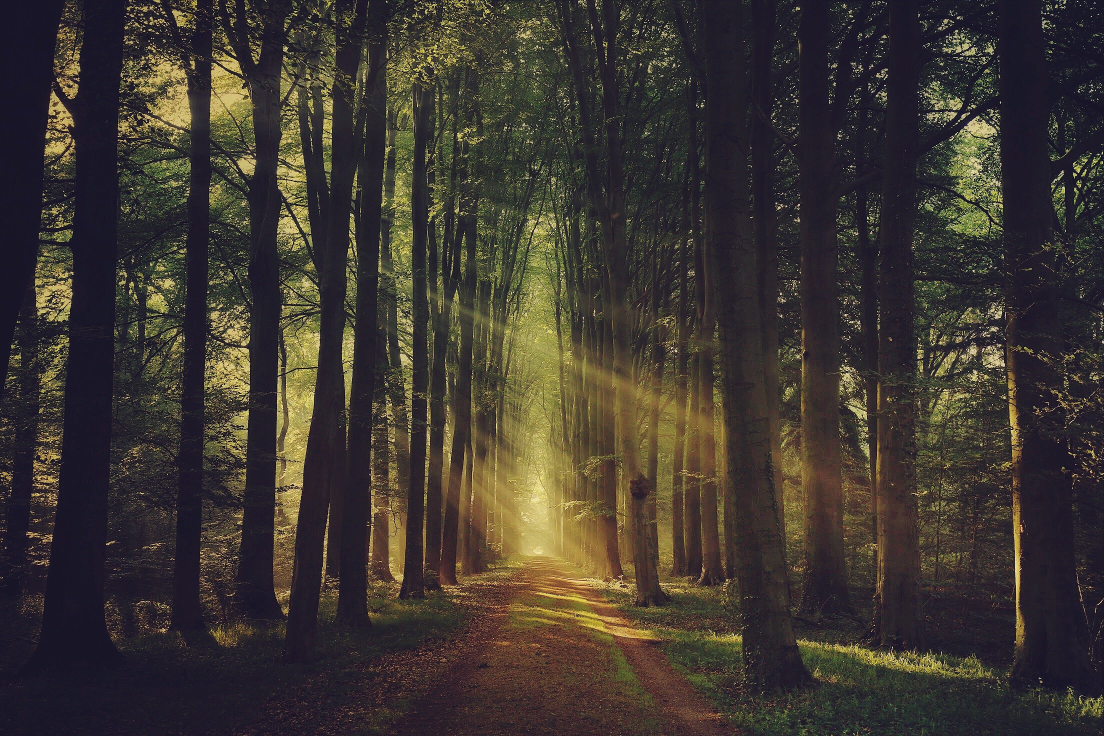
FORMULA CODE: BIBIEDL
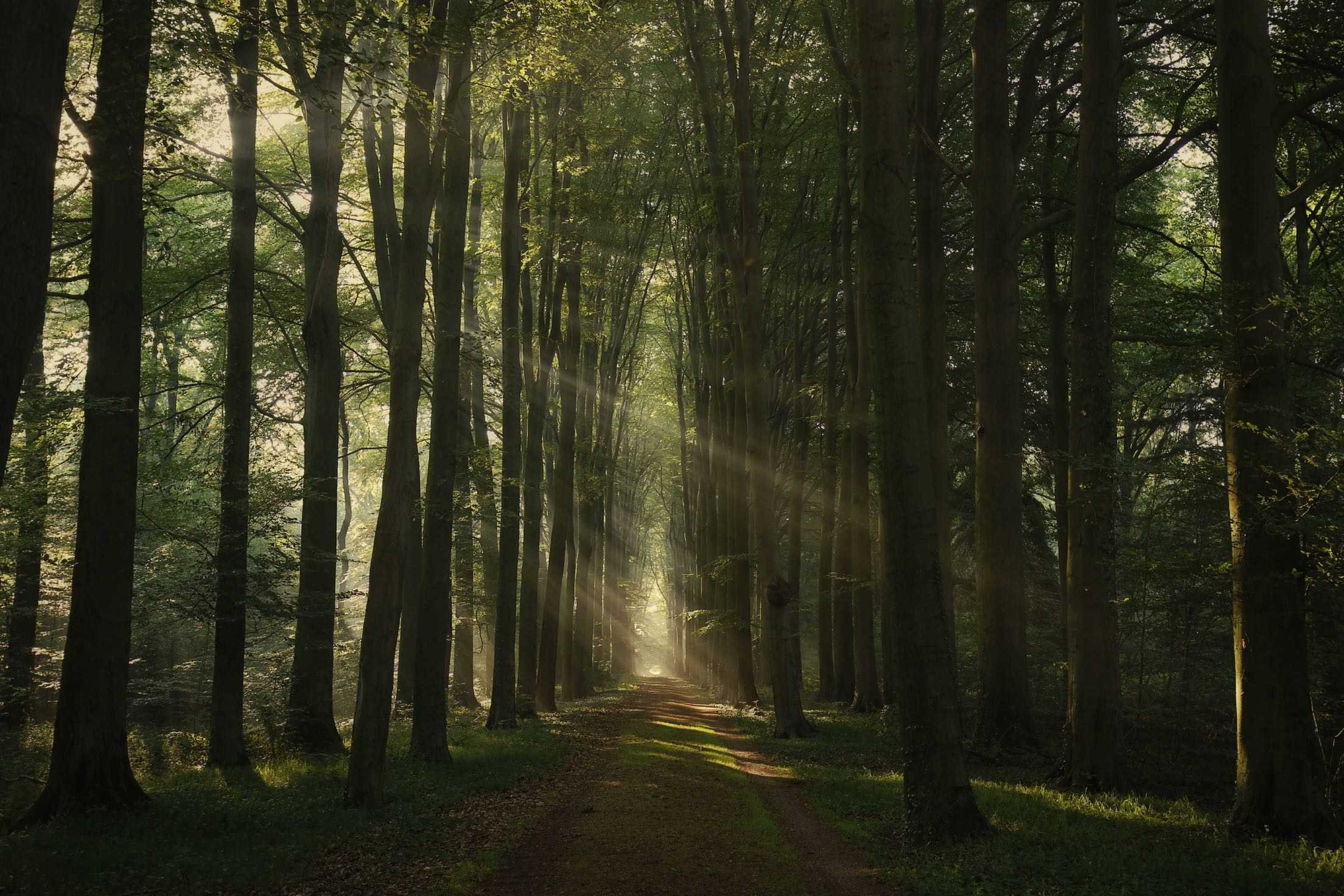
I knew immediately with this photo that my main goal would be simply to make the image look a bit more cinematic - like a still from a film. The FORE overlay from Radiance always works really well with sunlight so I added and adjusted the orientation in such a way that it would add a light to dark effect from top to bottom. Next, the FORESTRY overlay from Landscape Enhance helped me to increase the drama in the sunlight in the bottom right corner while 1960 from Vintage Gradient added just the slightest amount of focused light in the middle of the image right down the pathway. INSIDIOUS from Atmospheric allowed me to darken the bottom left and top right corners, calling the viewer's attention to the stream of sunlight pouring across the forest. The last overlay I added was the SUNFLOWER Light Leak, mostly just to be cute before applying the PX-680 ALT film preset and adjusting my polishing tools to give this image the pizzazz it deserves!
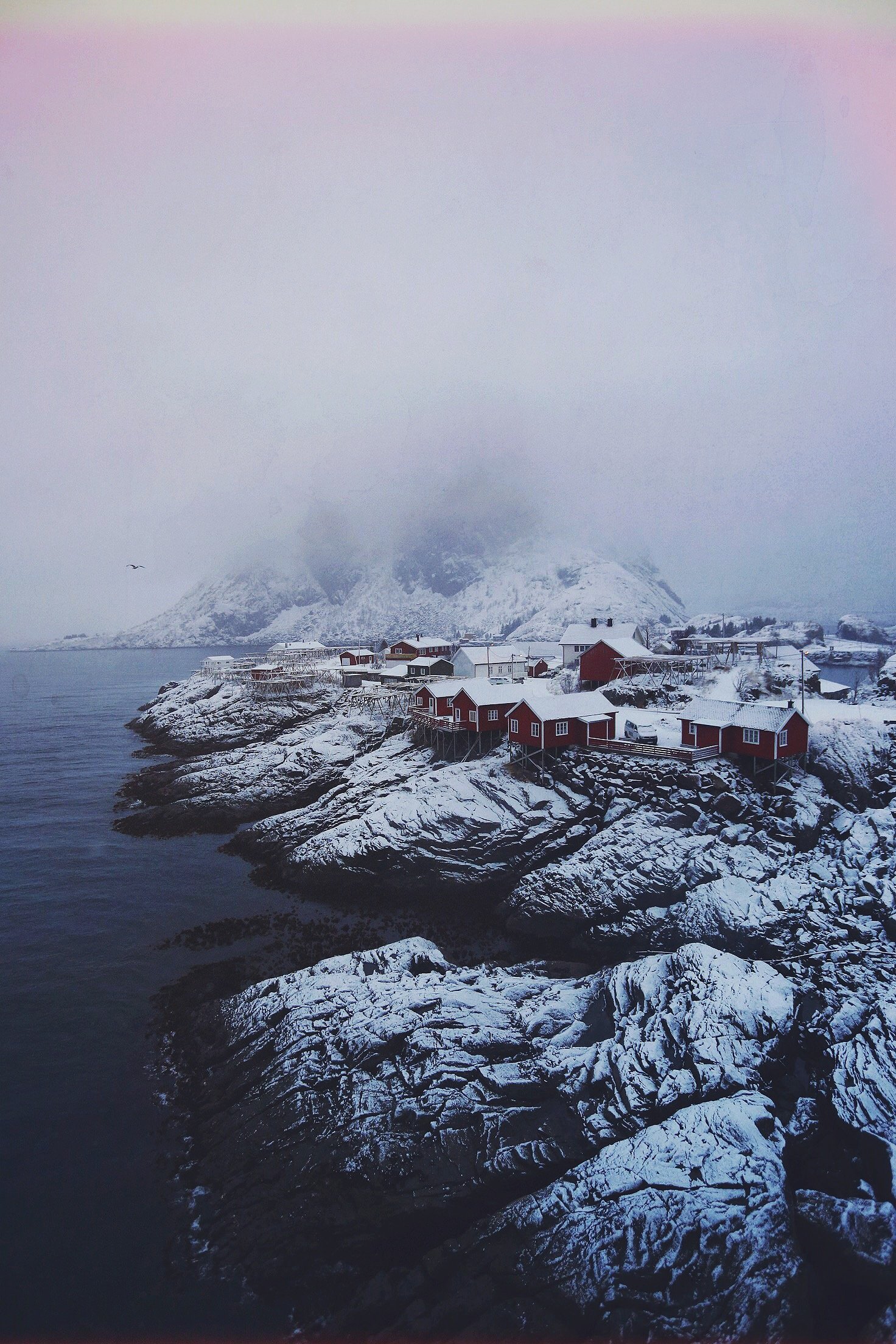
FORMULA CODE: UAKGJVV
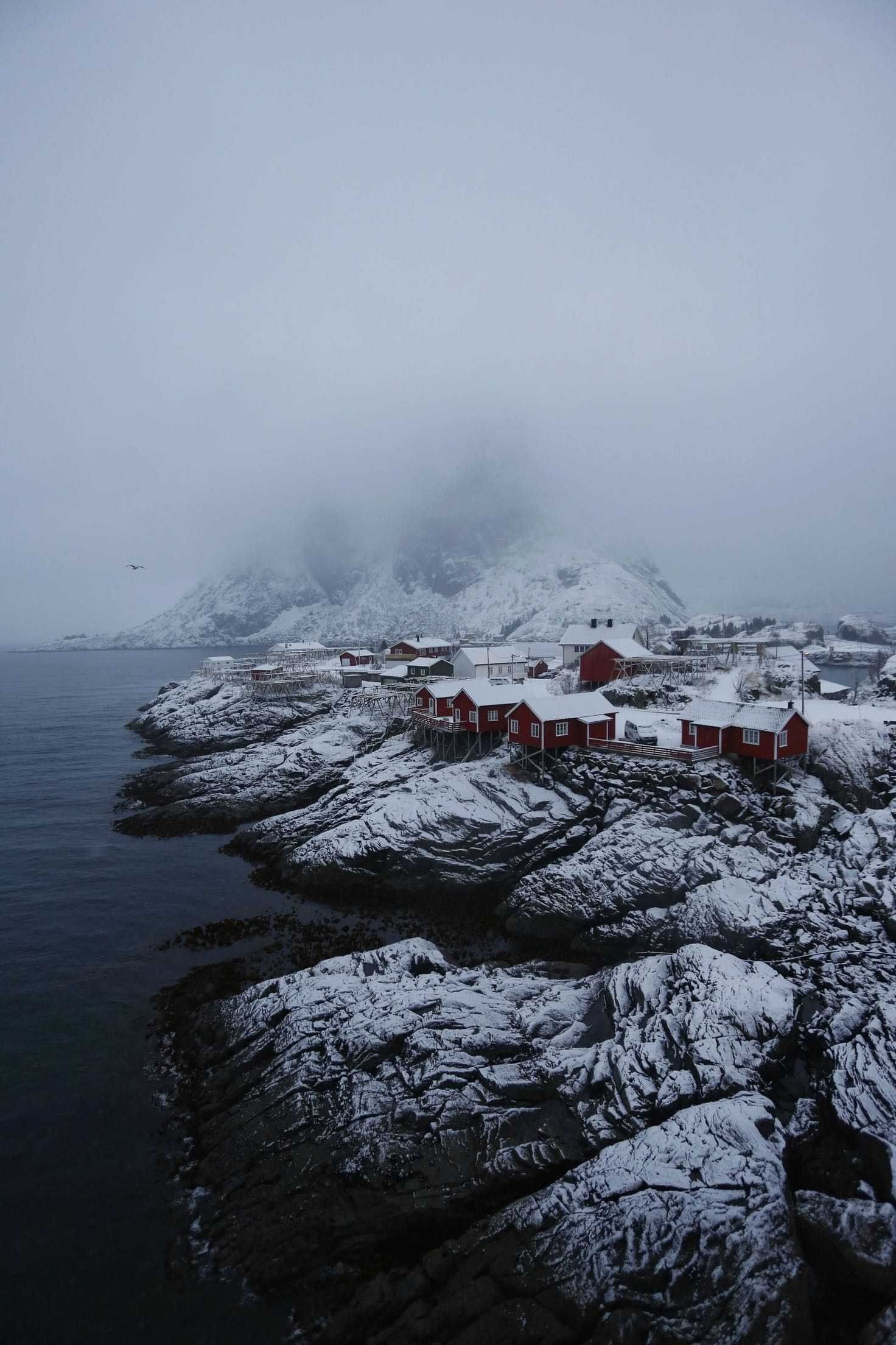
This photo of Vincent's was so beautiful to begin with that I hesitated even editing it, but I decided to try to add a little but of unreal color to what looks like an unreal scene. Here, the EDGE BURN light leak gives me a touch of an analog feel and I used DREARY from Landscape Enhance to complement the coloration I had added with the light leak. The SEAFOAM Vintage Gradient helped me to cool off some of those reddish hues while SLATE from the Intensity pack allows me just a touch of texture along with adding a little bit of light to the foggy backdrop. I used the STAID overlay from Atmospheric to pull just a little bit more of that lighting out in the backdrop while also adding INDIGO from X-film to help smooth out my colors, contrast and fade. I love to use the F-FORTIA film preset to help pull together a formula so I added it here, played with the exposure, contrast, saturating and sharpness.
Check out more of Vincent's photography here and more images from the Collective here!
