MEXTURES SESSIONS: @BYRDFORTYSIX
This week we were fortunate to catch up with Jared Byrd (@byrdfortysix) to gain a behind the scenes vantage point on his editing process for three of his images. Jared's landscape and portrait work is most excellent and our hope is that reading about his editing workflow and seeing the transformation created by his Mextures formulas will both encourage and inspire you to continue creating amazing artwork!
Formula code: FHTQJLF
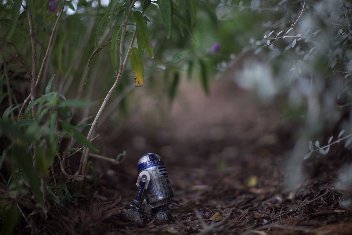
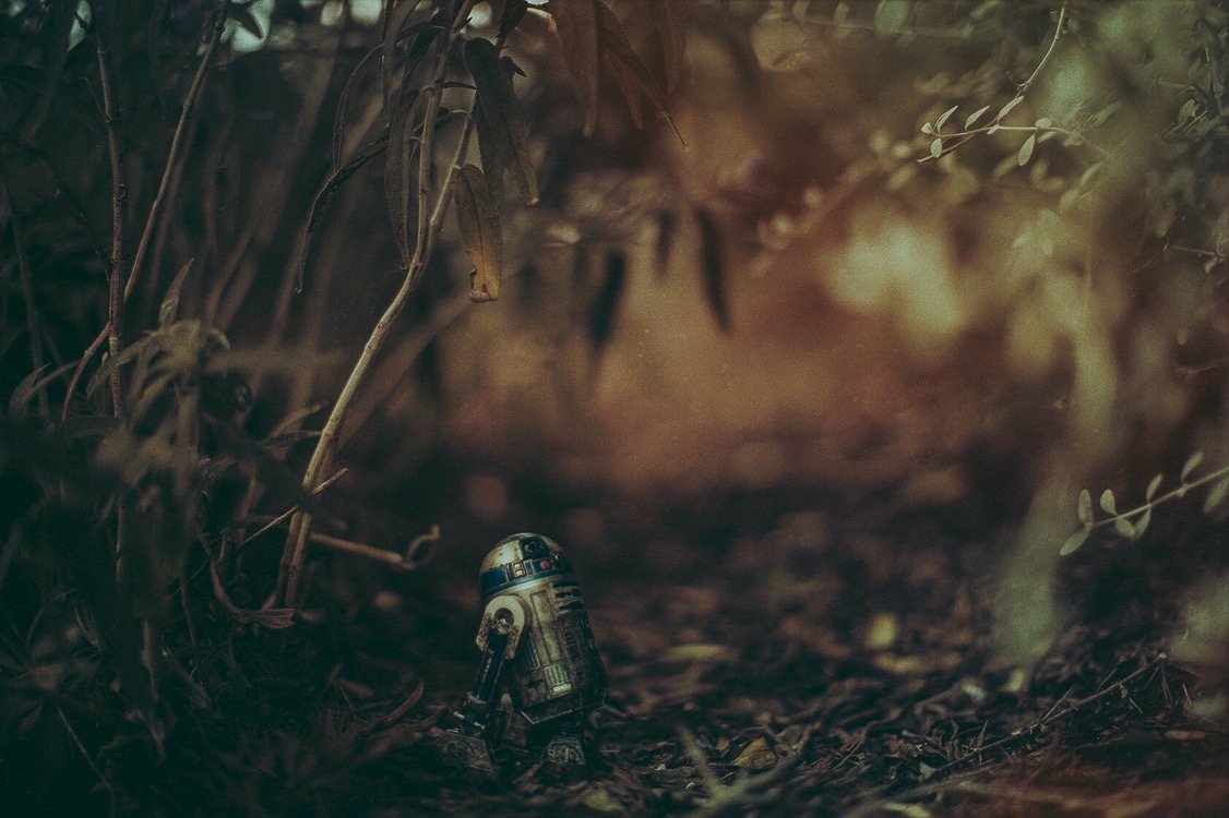
For this image, I began with the idea that I wanted to recreate the dark and swampy film look from The Empire Strikes Back. I really liked my raw image and it's obviously a great starting place to like what you've shot, unedited. When editing exclusively with Mextures, I always play with the adjustments and blending modes to find the exact temperature and feel I'm going for. For the Artoo picture, I just used "dark and de-saturated" as the springboard for the rest of the editing process. Dirty Pop from the Grunge pack, Vintage from the Vintage Gradients pack and the F-FP film preset do the heavy lifting for me.
Formula code: UZKVENI
Model: @thatstrite
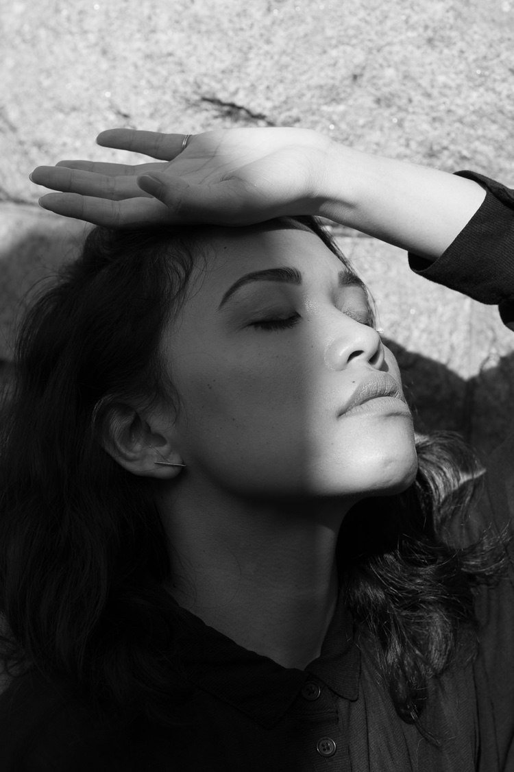
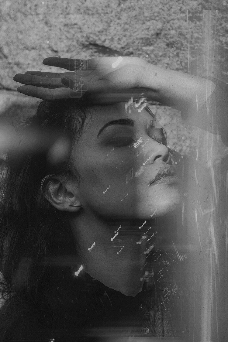
My friend and I met up and did a portrait series in the Mountain View Cemetery in Oakland, California...on Halloween. It was fitting. The unedited image is simple and I liked it as-is, but had the idea to start mixing my film shots with some of my digital work. The over layer is a long-exposure night shot from an old Mamiya/Sekor MX500 35mm camera. I blended the two in Photoshop and dropped it into Mextures to add additional lights with "anomaly" and "light leaks." Most of my editing has been very subtle with a lot less of a dramatic effect. I'd recommend trying the formulas on images that feel close to finished, but leave something left to be desired.
Formula code: QQTILTZ
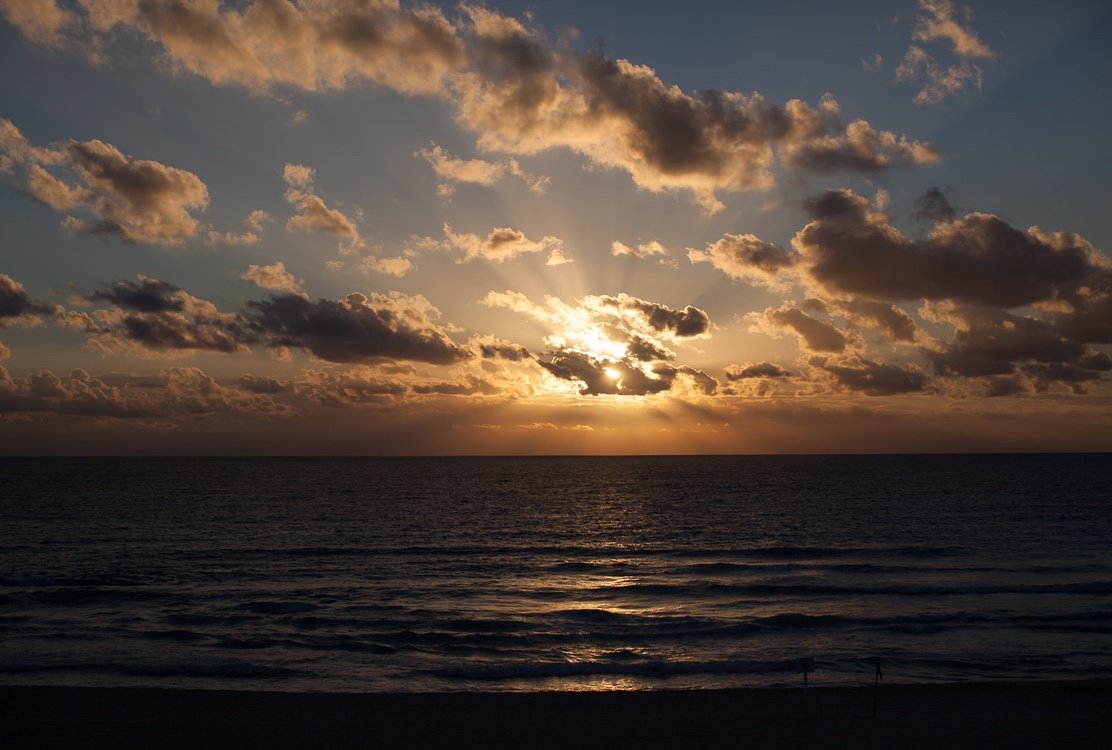
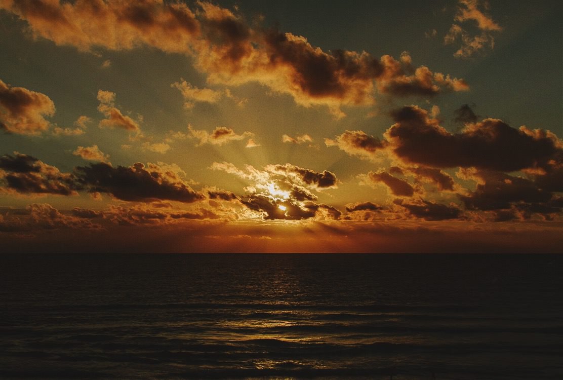
My most recent trip to Cancun, Mexico really inspired me to capture the sunrises and sunsets differently than I had previously. In my experience, most raw shots of really beautiful moments are lost in translation. This sunset was a rare instance in which I was able to recreate the experience for myself through the editing process. I used a subtle "120mm/difference" along with a vintage overlay at really low opacity. I capped it off with "fore overlay" and "brick/exclusion" to round the levels out. As always, my adjustments pulled the highlights down a ton.
See tons more of Jared's work here and here or on his website!
