
MEXTURES SESSIONS: MATT MILLS
Matt Mills (@stockandrender) has been churning out brilliant visual art for years now with no end in sight. Few things in life are easier than getting lost in the vivid and delicately constructed graphic pieces that he creates. We've discussed his use of Mextures overlays to construct a sense of depth and substance in the past, but we wanted to take it a step further. We asked Matt to walk us through his editing approach for two of his pieces to give us an in-depth look into the how and the why of his Mextures technique. Below you'll find what he shared with us along with his corresponding Mextures formula code. Let us and Matt know what you think!

FORMULA CODE: LWFPXPY
This piece was a collaboration between Tim Sandwick (@timsandwick) and myself. He sent me the glowing circle in a volcano part and I initially edited it with the Union and Fragment apps. As is usual for the last step in my process, I brought the image into Mextures to give it some texture and color variation. I like to use the DIANA film preset a lot and thought that would give this piece a nice, moody feel. Then I applied some textures from the GRIT AND GRAIN and EMULSION packs. These are what provide that grainy feel that you’ll see in a lot my work. From there I layered on multiple color gradients from the LANDSCAPE ENHANCE pack to add touches of color. I used the OVERLAY blending mode for these. Next, I threw on some lighting effects from the LIGHT LEAKS packs to draw out more depth from the image. And lastly, I like to push the SHARPEN slider up as a final step to make sure all of those little details really stand out.
FORMULA CODE: BPNDMZN
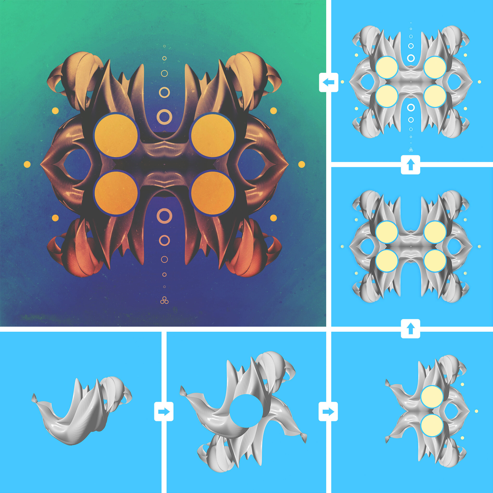
Here is another example of how I use Mextures as the final step in my workflow to give my designs a bit of a dramatic feel. This piece started out in Photoshop as a single abstract 3D shape. I then mirrored that several times and added some simple circle variations over top to give it some additional detail. As you can see, before coming into Mextures, the image was pretty sterile. One of the ways I like to really push the initial design is to use the DIFFERENCE blending mode with any of the texture packs. It really shifts the design and can give me a unique look that I had never intended to create. For this piece I chose the OKEFENOKEE texture from the VINTAGE GRADIENTS pack and applied the difference blending mode at 78%. That did most of the heavy lifting. From there I just added a texture from the EMULSION pack for some grunge and the NOISE COMPLAINT texture for a bit of graininess. Lastly, I played around with the film presets and chose PX-680, another favorite of mine, and bumped up the sharpening a bit to draw out some of the background texture.
Take a gander at more of Matt's work here and visit his website while you're at it!
