HIGHTLIGHT: GEO CUNNINGHAM
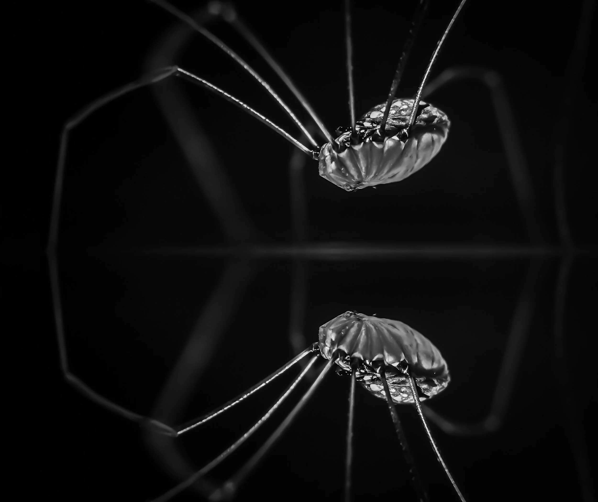
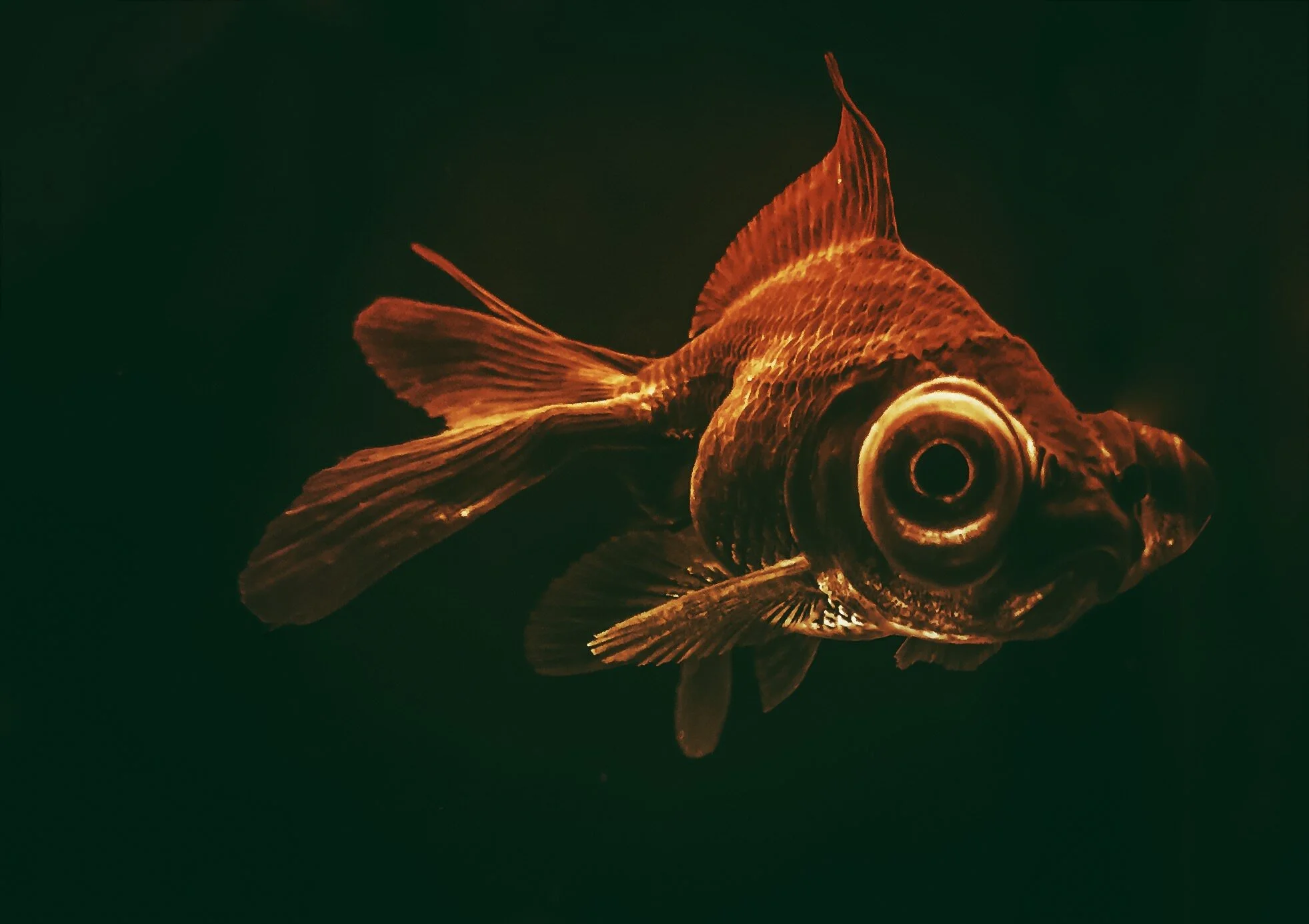
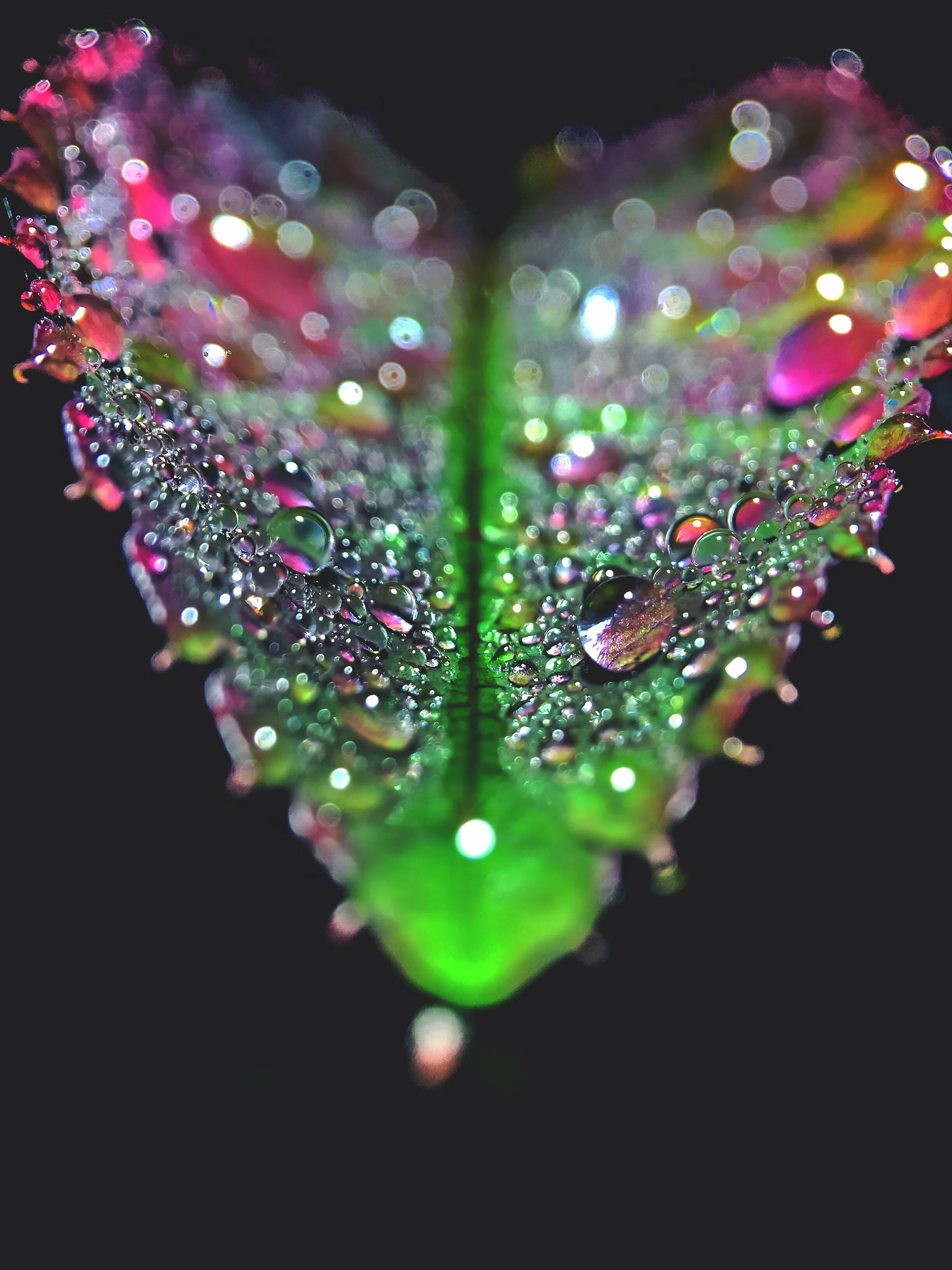
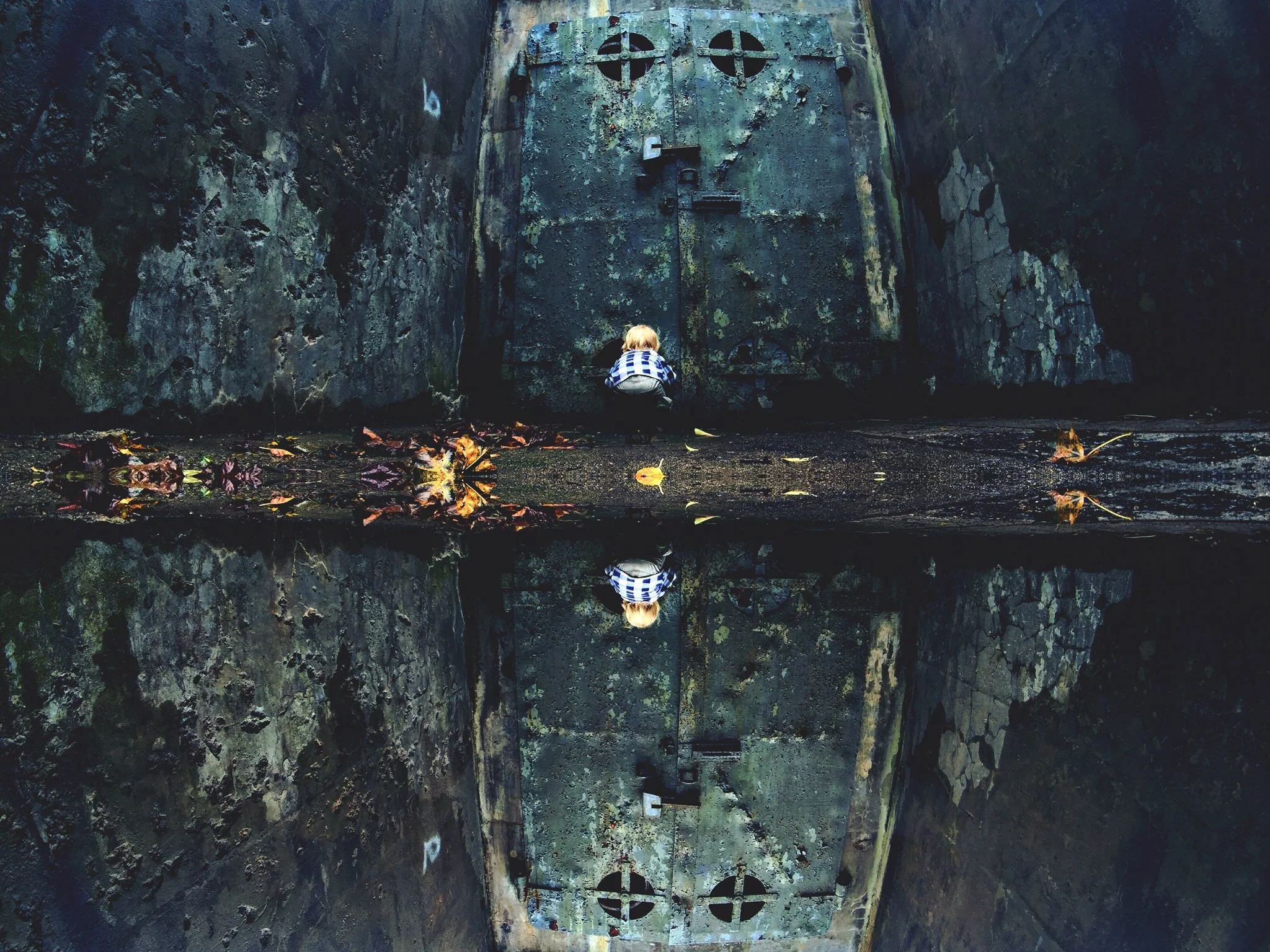
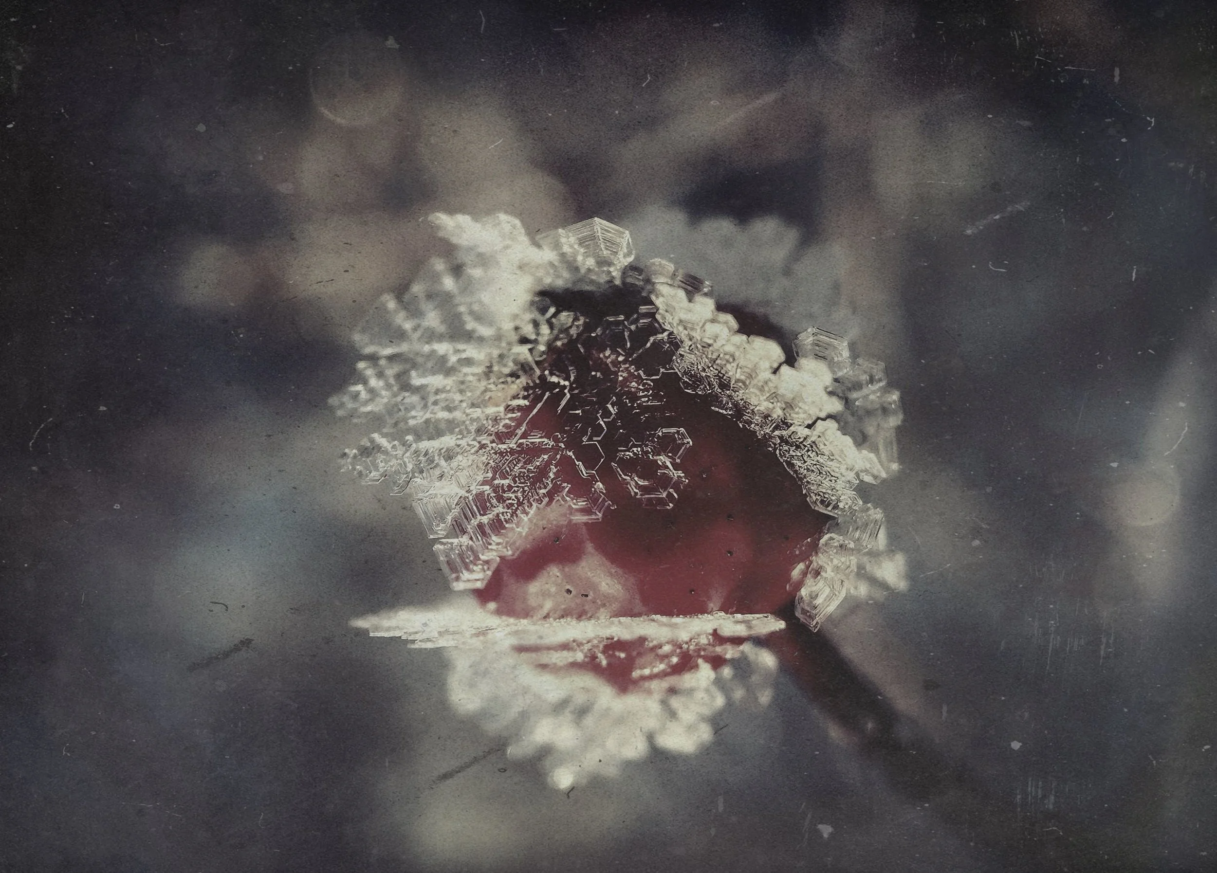
There is a motion to the photo work of Geo Cunningham (@geocunningham) that is both soothing and neurotic. In many of his pictures you can almost feel the vibrations of time echo through the captured image as flickering colors move in and out of frame. His macro work delves further into exposing the ingredients in the world beneath our feet and all around us. We caught up with Geo to hear more about his love affair with the creation process and with photography in general. Real along to learn more!
My name is Geoff Cunningham, but a lot of people (particularly on Instagram) just call me “Geo” because of my Instagram handle. I live in the Seacoast area of New Hampshire—a home base that puts me in a wide breadth of environments ranging from deep forests and mountains to rocky beaches on the Atlantic. It is here that I spend my time mountain biking and shooting — both of which usually occur at night after the tiny adventurer (my two year old) is fast asleep. My 1,300 lumen mountain bike light is used for both disciplines. It feels like it’s night all the time right now so it works.
I’m the creative director for MicroArts, a boutique branding agency. I basically name companies and products, develop their personalities and help come up with their ad campaigns. I get paid to come up with ideas that create emotional connections between people and brands — everything from molecular cancer diagnostics to mountain bike helmets. I am not a designer … I’m a writer who began photographing during my time as a journalist — a job that is worth 100 college educations.
I use Instagram to house a number of different story arcs that I have going on in my mind and some of these threads may be part of bigger or more finite things in the future. It’s kind of a sketch pad for my brain, which is probably why perspective/styles/stories are frenetic as sh*t. I’m just pumping out ideas and seeing what sticks for myself and audience. My shooting and processing are very rapid. This isn’t the Sistine Chapel … I’m throwing paint and making sure the words help push or confuse the visual. I love interacting with the Instagram community and seeing what people are riffing on.
HOW DID YOU FIRST GET IN TO PHOTOGRAPHY?
I got into photography while working as a writer for a newspaper. They would send photographers to my story assignments, but I really wanted to capture my own perspective on things. I began shooting my own shots and they started finding their way on the front page. Then my editors realized they could save photography resources for other reporters. It was a win-win for everyone. When I stopped working as a journalist I was looking for outlets to continue with my visual explorations. I spent months making these giant elaborate (OCD-driven) collages using acrylics and tiny squares of paper cut out from 1950s science books (hilarious what they considered fact back then). I love making these pieces, but needed a more immediate outlet and photography is a much faster way to communicate visual ideas that don’t need to be poured over. It challenges me to be less deliberate and just react to environments. Like the poet William Carlos Williams or something … “no ideas but in things”. But W.C.W would hate me because I attach ridiculous stories to the “things” and totally blow that up on the backend. He would say bugs are bugs … they don’t have feelings. That’s the point Bill! It’s what makes humans unique and idiotic … complicated … like the little critters and worlds that we understand least or are downright afraid of. So I guess I got into photography for the second time to better see into the life of things … the tiny adventurers of the world (my son’s youth) and tiny worlds (creatures/environments) we rarely see or appreciate enough. That’s why I like to say “i see” … because photography is revelation for me versus just expression.
WHAT SORT OF GEAR DO YOU PHOTOGRAPH WITH?
I am a minimalist when it comes to gear. I know photographers that seem to be more passionate about their set-up than the product itself. That’s just not my thing and its mostly because I don’t want to be restricted by bulky equipment. I have an expensive DSLR that I never use. I shoot exclusively with an iPhone 6 with a @Moment case and lens collection that allows me to carry everything I need right in my pocket. The Moment case allows me to control exposure and focus (independent from one another) and allows me to attach a macro, wide angle, tele and fisheye lens right to my phone. It’s good glass, but requires more effort to get where you need to be to get that shot. I like that challenge and I am filthy from rolling around trying to get “that shot”.
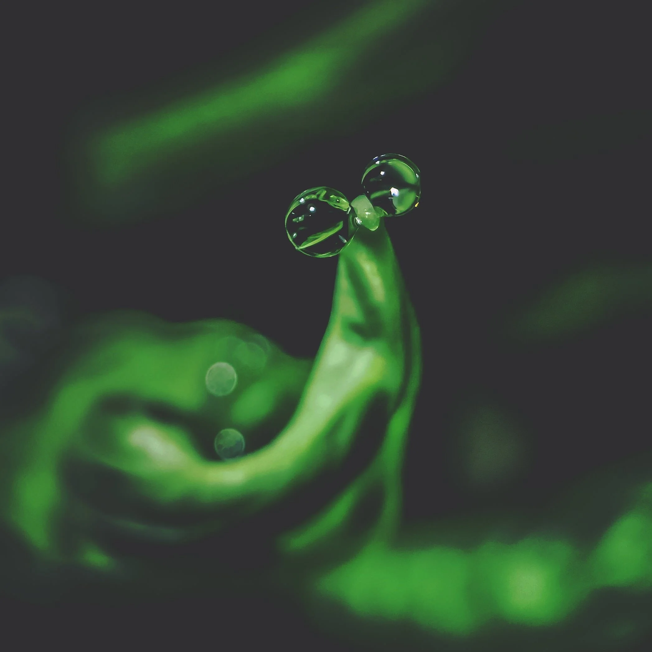
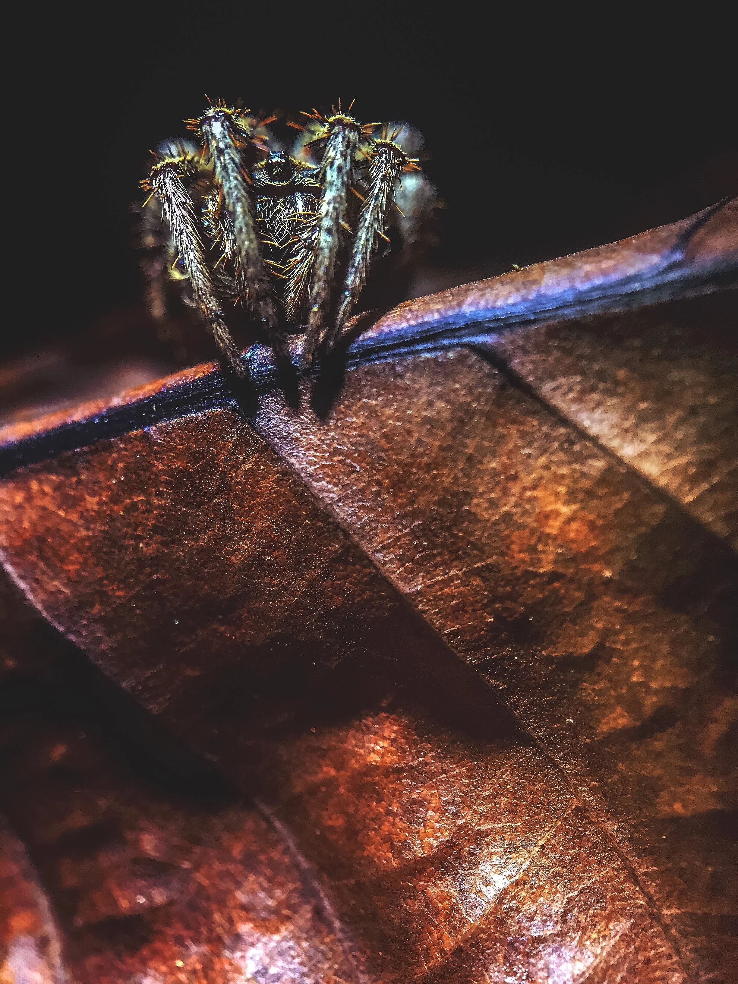
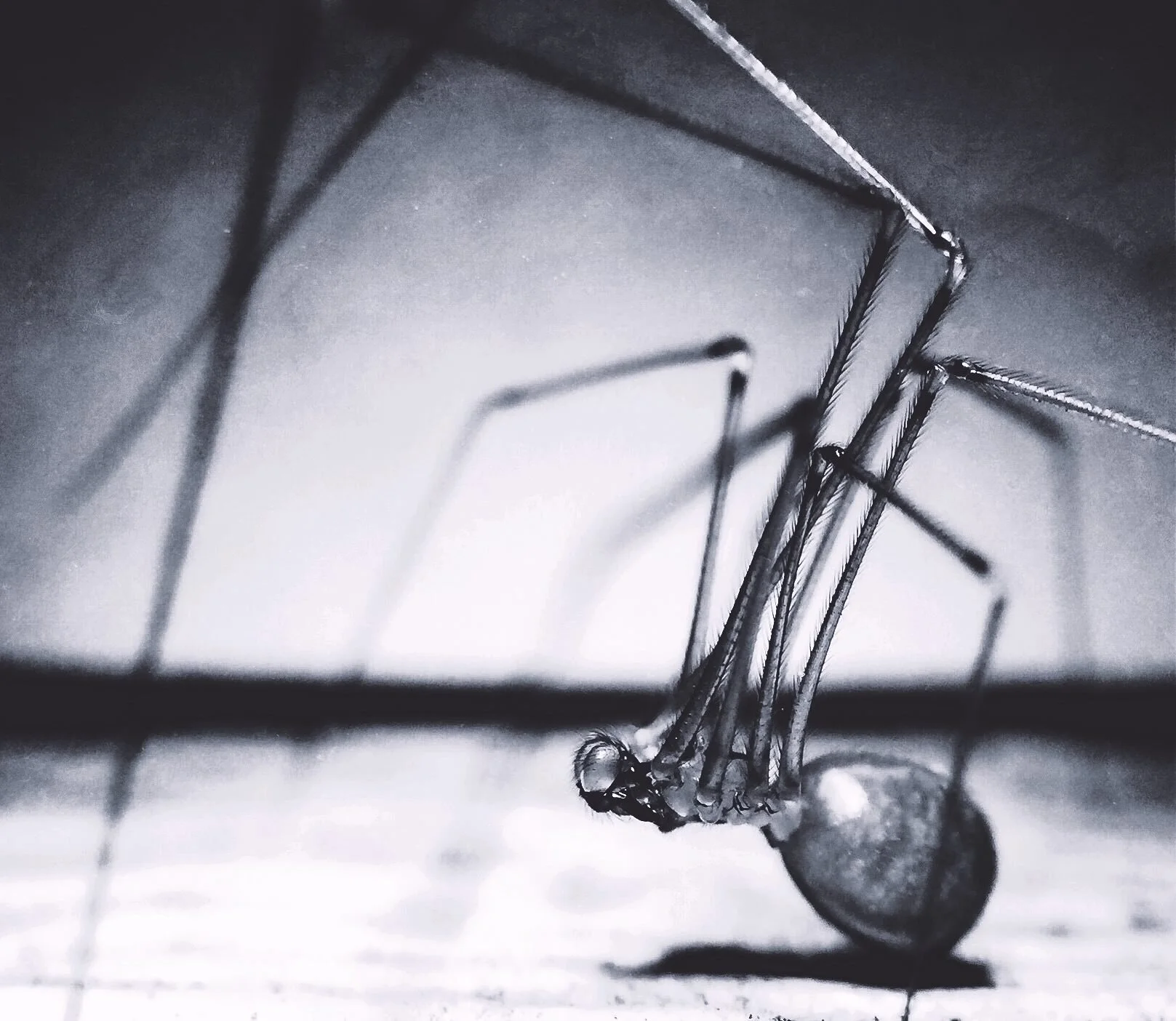
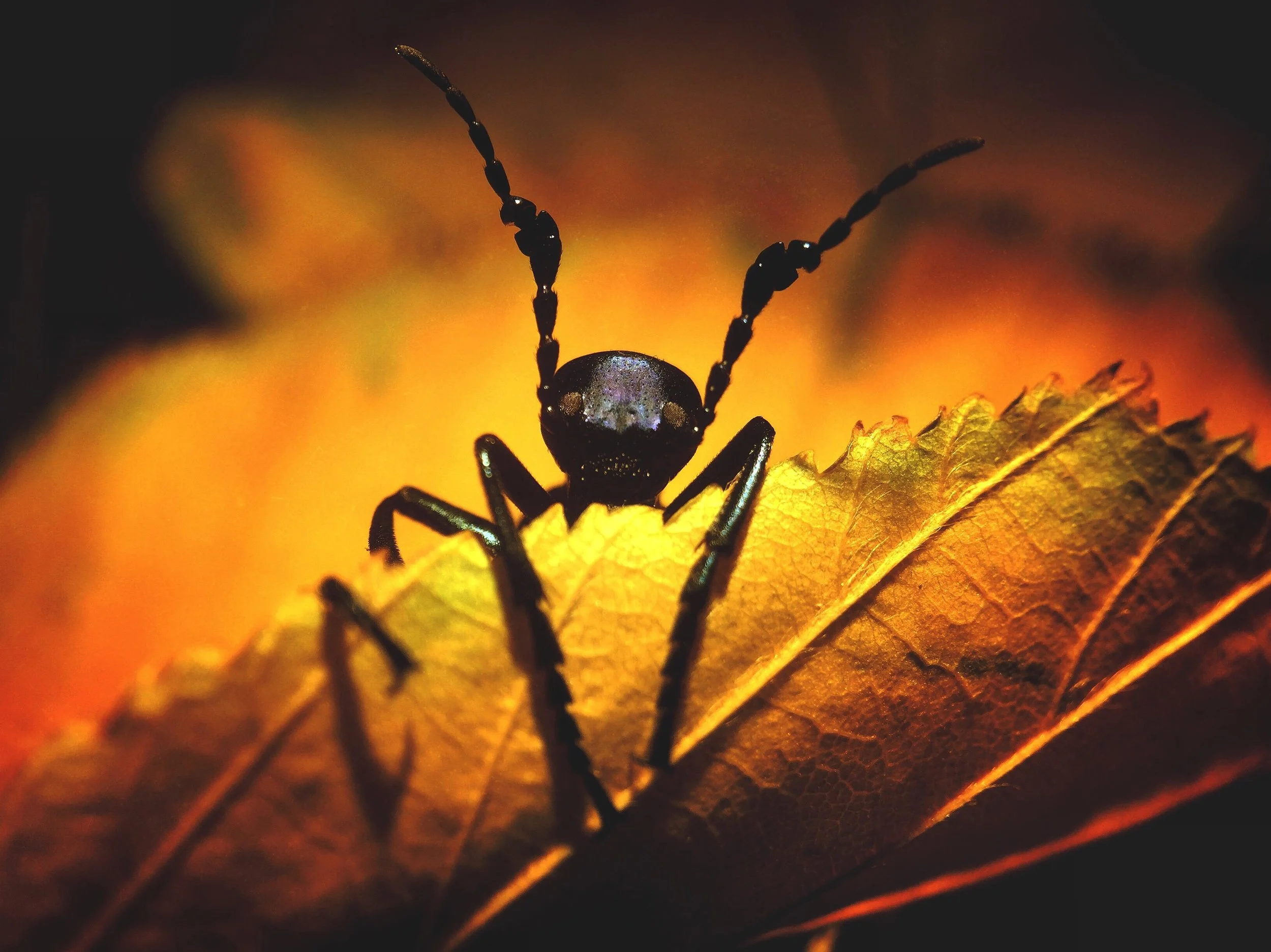
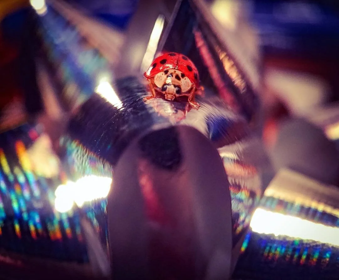
The macro stuff is ridiculously hard because there is no aperture control and you need to get on top of the subject-which for me is usually insects. There is an intimacy there where everyone (including bees, spiders, etc.) need to be comfortable with what is happening. Yes … I’ve been bitten and stung. But its kinda like snake-charming and you establish these mini relationships with your subject. You accomplish something together. My most unique tool is probably a 1,300 lumen mountain biking headlamp (I don’t use flash) that I use very often during night photography (which is when the macro world really comes alive). It attaches to my helmet and I admittedly look like a crazy person out there. But it works.
HOW WOULD YOU DESCRIBE YOUR STYLE?
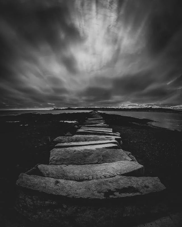
I don’t know if I have a style as much as a mood or an approach that varies depending on the story arc that I am trying to work through. I think the style need to fit the characters and scenes you are shooting so I try to let the subject dictate that. I see a lot of photographers with a very deliberate and recognizable style that they carry throughout … a signature look that has their expanded Instagram feed looking like a perfect mosaic—a beautiful collection really. It’s too disciplined for the different stories I’m working on. I try to shape the style based on the idea or emotion that I am trying to convey. I am fairly obsessed with composition and I suppose my only consistent style is playing with juxtaposition - small things in big places and vice versa … or light and dark. The style is very tight or very wide and I have no middle ground most of the time. These juxtapositions (big/small and dark/light) are important styles in my two major story arcs (the tiny adventure and all my nonsense with bugs).
WHAT DO YOU WANT VIEWERS TO TAKE AWAY FROM YOUR WORK?
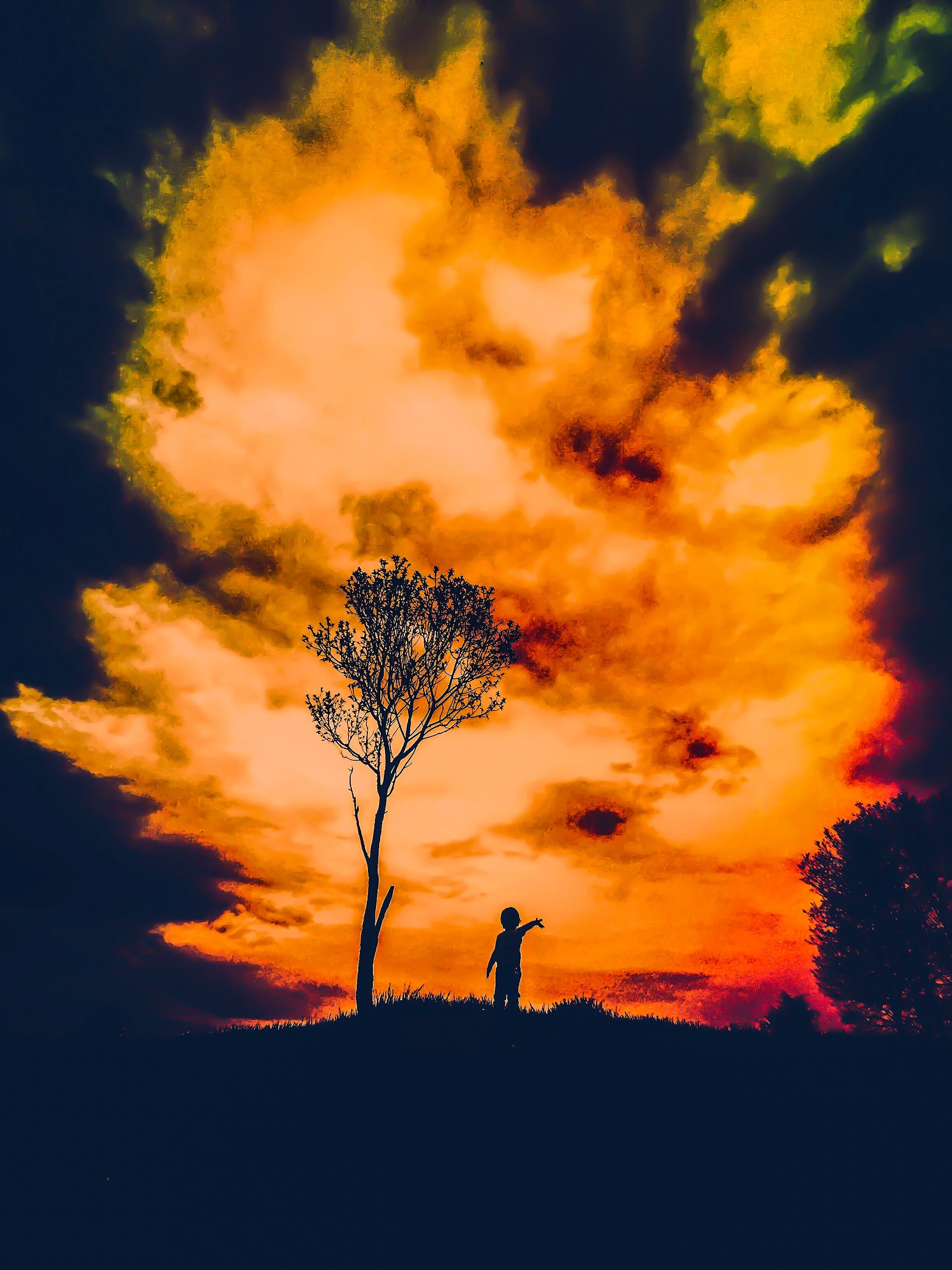
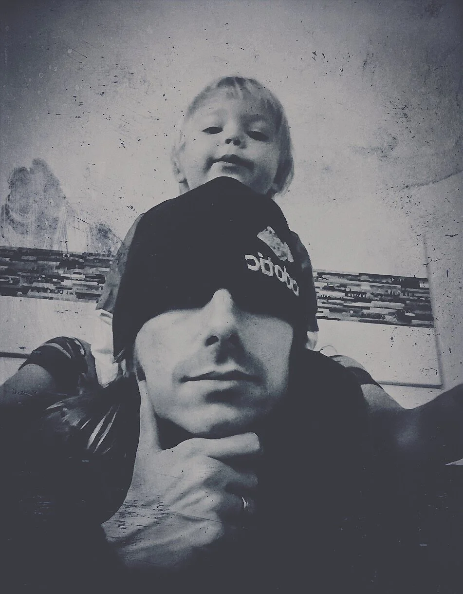
Whether it be loose or more pointed, I am really communicating a larger theme of perspective as it pertains to adulthood. I feel like adults are conditioned to think big picture and sort of trudge toward some expectation of success while stubbing their toe on all of the stuff that matters. We worry about goals, and ignore the parts … the tiny things. My “tiny adventurer” series is about this explicitly and kinda tells it through my 2 year old son. You become a father and get this chance to see how you approached life as a child … tromping with unabashed excitement and no destination. You see into the life of things as a child. You don’t care about the objective or what anyone thinks. It’s a ridiculous and beautiful way to live. And it’s super ephemeral because that gets beaten out of by reason. I’m trying to capture that and communicate how we can still live that way as adults if only for moments a day.
My macro stuff is far less literal, but it follows a similar arc in saying “pay attention to the little things and moments”. I’m humanizing bugs because they live deliberately unlike humans. Humans obsess with the melodrama … the little crap that snuffs out each day’s fire. I really hate that. See a fleck of snow or millipede and let it be the biggest thing in your day for f*ck’s sake … give that to yourself … you could get squashed tomorrow. I guess I’m scared we are all missing it sometimes. My photos are trying to keep it and pay it forward so people aren’t worrying about the curtains.
WHEN YOU ARE OUT SHOOTING HOW MUCH OF IT IS INSTINCTUAL VERSUS PLANNED?
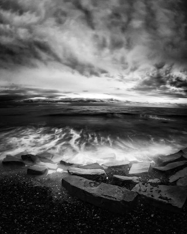
I’m pretty stream of consciousness when it comes to shooting. The subjects I love most don’t follow plans … they are these kinetic little beings that are unwilling to remain still and I kinda take what they give me and consider it to be a gift. I like to just see things and react because I really don’t want it to be a chore — another element of life that sets unnecessary expectations. I am generally not as pumped about staged shots and appreciate more candid moments. That being said … once I see something that interests me, I will admit to being fairly obsessive compulsive about getting what I am looking for and maximizing the visual potential of the subject. I have this back-of-my-mind fear that there are some things I might never see again. Sometimes I kind of have to take a deep breath after I’m done shooting something because I’m so dialed into nailing it in the 10-15 seconds I might have with it. Things like sunsets/clouds are more cooperative, but they are kinda the pizza of photography right? Everyone likes them, but very few are truly remarkably good if you really think about it. My editing is similarly wayward and rapid. I just run it through programs I like and I’m usually there in under 5 minutes. I let it be what it is and I rarely go back to it.
WHAT DOES YOUR EDITING PROCESS GENERALLY LOOK LIKE?
Because I’m fairly obsessive about getting the images a lot of the way there without heavy cleanup editing, my process is fairly quick and done completely on my iPhone using a handful of apps. The process is a little all over the place, but let’s break it into three parts to try and make sense of it.
Getting it clean - I usually begin by making minor “cleanup” corrections in the mobile version of Photoshop. I largely use this app to crop, enhance clarity and de-noise the photos. I tend to gravitate more toward a tack-sharp look, so both of the later tools are a go-to on nearly every photo — even if I end up muddying them up on purpose later. I will occasionally run the programs through the mobile version of Lightroom if I need to make more subtle lighting changes, but I have little patience for these nuances in most instances.
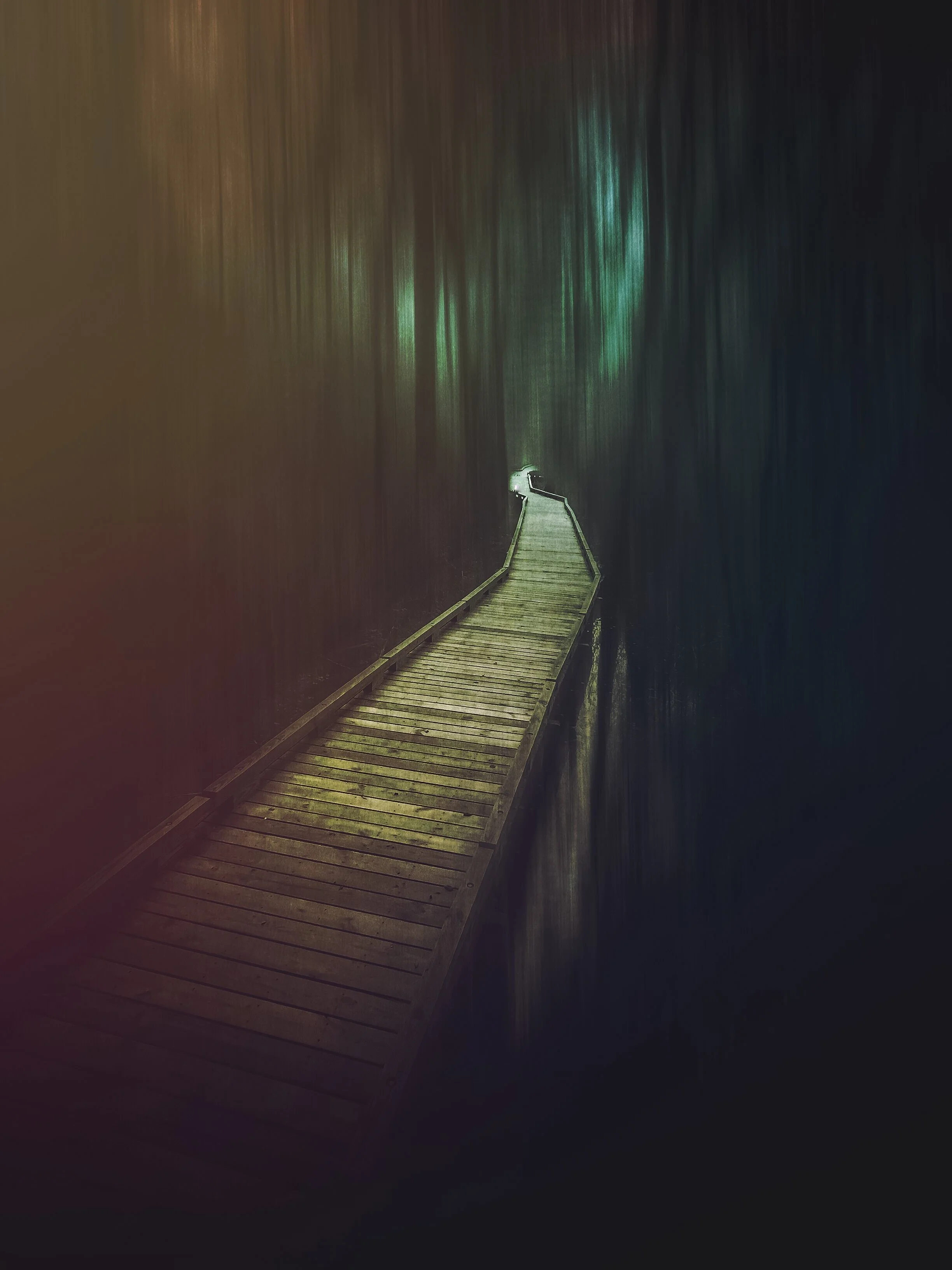
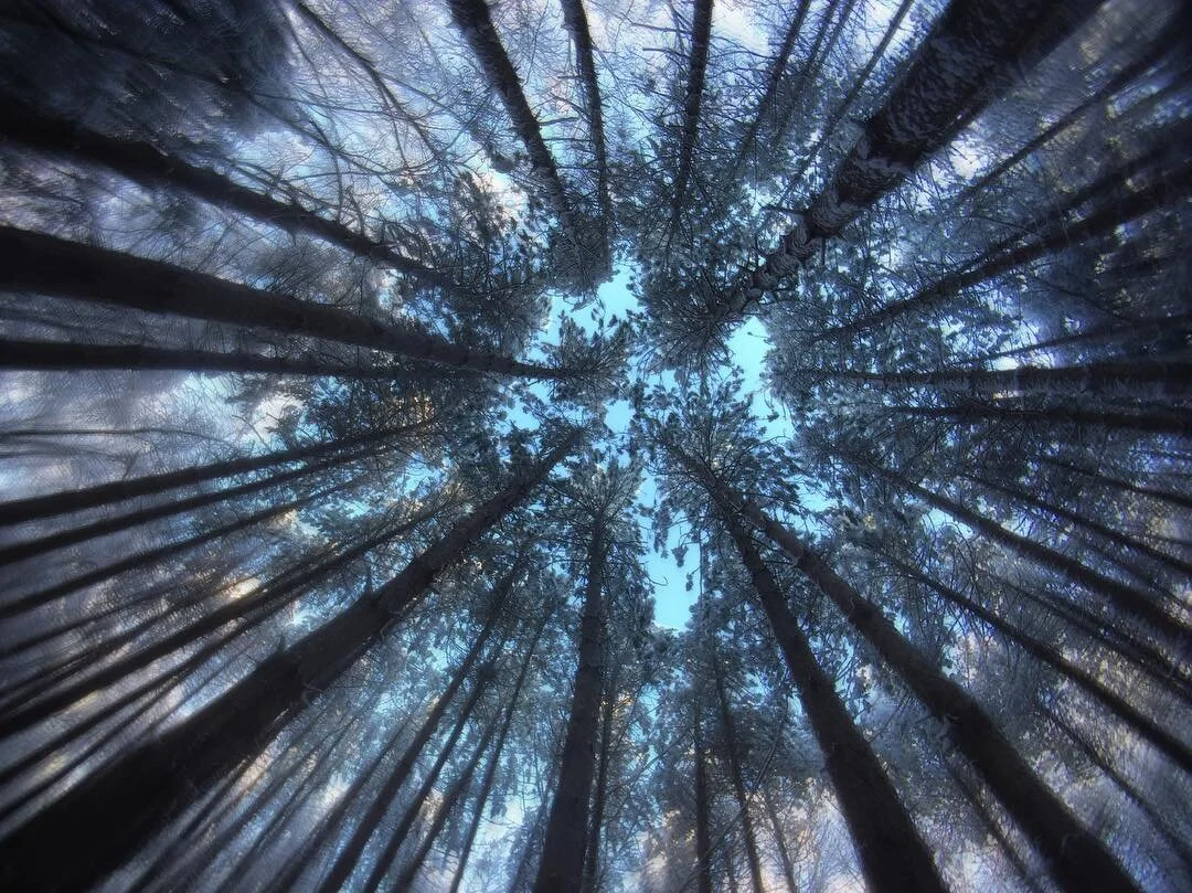
Making it move - Once I am happy with the general look of the photo, I will then decide if further creativity is necessary to set the tone of the intended story. I am generally not a fan of super heavy editing (at least in my own shots) and I think there is a razor thin line of just crushing the sh*t out of a shot with excessive filters. That said, I do like to create movement in my photos so I will use programs like PicsArt to add the blurring that creates more dynamism. I am partial to a focal zoom blur and radiating blur for my more abstract stuff. My most meticulous editing usually comes in creating a blur and erasing it from other parts of a photo. However, in many instances I simply skip this step if I feel the photo needs a stillness or uninhibited look to pay off the idea.
Setting the tone - Finally, I use Mextures as a final stop to enhance the emotion and more practically, as a primary tool for throwing light in the places that I want the viewer to focus on. I use Mextures on virtually every photo, however it is often used to make very subtle changes that make a huge difference to me. For instance, I will often use the many film options to flatten out the image and create a more matte look that reduces the depth of field. While Mextures can create wildly deep and intense textures/lighting, I find that a lot of my style lends itself to a fairly minimal approach so I am not heavy handed in those situations. That said, I play with a very different style on the “tiny adventurer” series. Mextures has been extremely influential in pushing that idea forward, because I apply more liberal doses of the textures (emulsion, landscape, grunge, etc) to create a more fictional and imaginary look—like an old children's storybook. I am not a formula maker, but I am obsessed with the formulas and use them in A LOT of my photos. I will apply a formula and then play with the settings or the ingredients that make them up. This flexibility is what makes Mextures the best photo editing app to me. You can hammer the thing and go as deep as you want. It’s basically an untimed shopping-spree in the world’s largest art store … just keep grabbing what you need to kill it with your shot.
As an aside … allowing people to lend their moods (formulas) is a brilliant contribution to the genre, both in terms of building a community and pushing people to try new things. I’m a branding guy … and I feel like Mextures has built a lot of brand loyalty for their efforts in creating tools that are really about the community. I see fast-follower editing tools trying to copy that attribute, but Mextures will always be the original—nobody can take that from them.
I have yet to delve into the world of saving my own formulas, but I think it’s one of the best features of Mextures. I need to get in there and save some of my own to pay it forward. What I will do is share some of my favorite formulas which I often use to create the looks you are seeing. I find them on the Mextures Instagram feed and end up importing formulas from people whose work I really love.
INCANDECENCE - TLIPKNX - from my bud @fridakitten - it is a killer for macro and I often mess with this formula in various ways to achieve a super solitary look that throws light on a single focal point.
COOL BLUE - KNDPEQC - from @aaronburden - it is a great formula for flattening things out and creating a more saturated image. It doesn’t have many parts but it is plug-and-play ridiculous.
LAMP - NCJXMWQ - from @rubesreyes - this one has a great brilliance that can warm up a photo and saturate elements that you want to pop.
I also play around with a bunch from @merderich - she kinda specializes in creating these muted brooding formulas that I always love.
DO YOU FEEL LIKE MEXTURES OFFERS ANYTHING UNIQUE TO YOUR EDITING PROCESS?
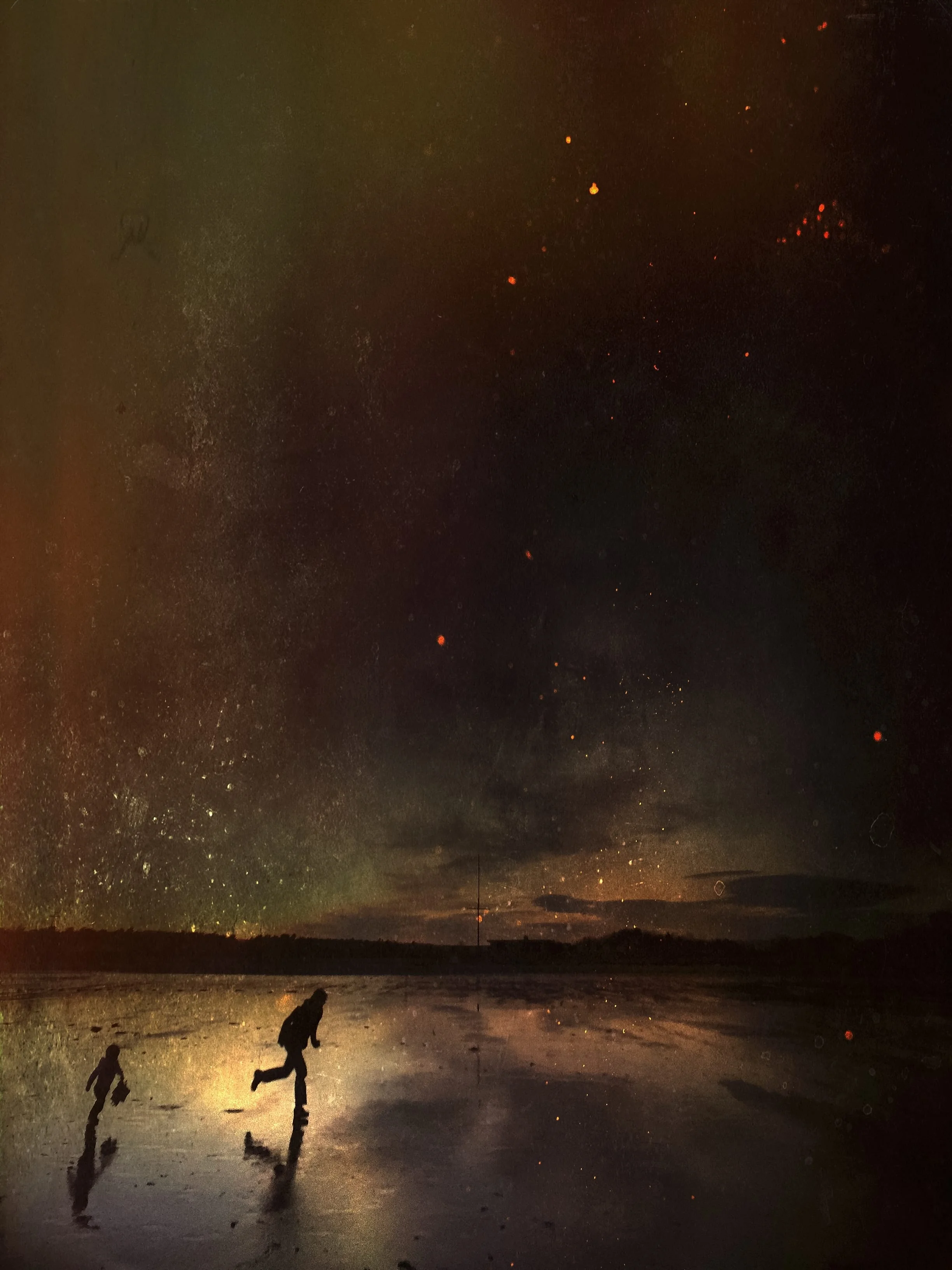
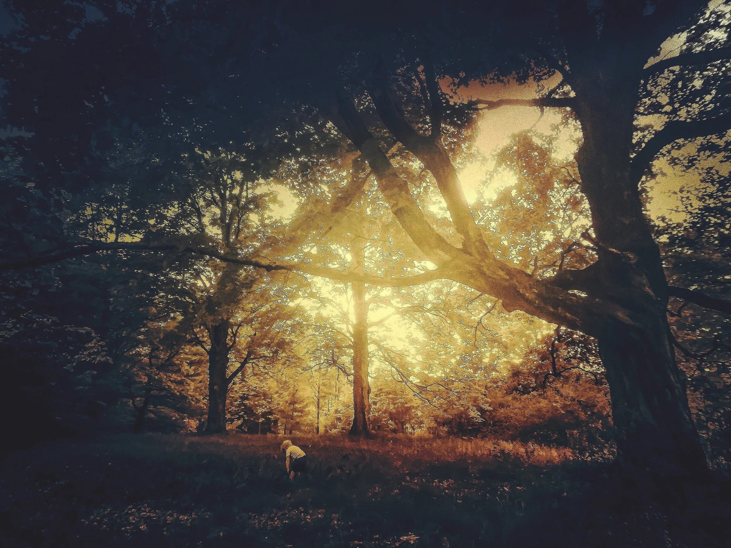
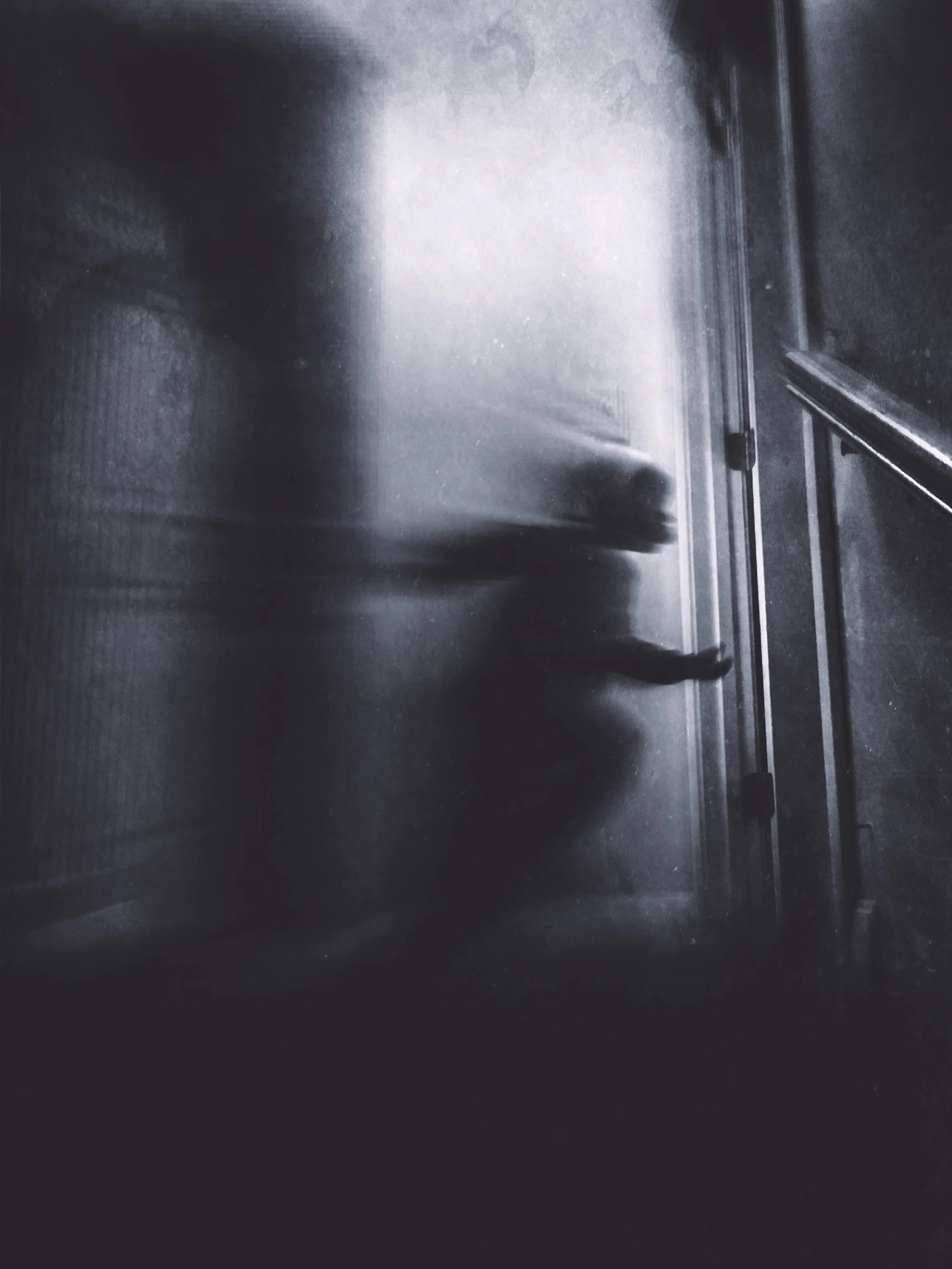
For sure. I think the formula concept and the community surrounding it are two really unique elements. You can kinda approach editing from two different starting points. You can start with a clean slate and build a from-scratch look with all the different packs or you have the option of starting with an existing formula and deconstructing it to suit the photo you are editing. I like the reverse engineering approach a lot for some reason—maybe because it gives you a benchmark for what you like about the application of certain layers versus just starting at the beginning and using trial and error. Mextures also provides a very wide swath of looks ranging from the gritty and muddy to the soft and illuminating. If you think of your photos as stories—theatre really-- this provides a lot of flexibility to set the scene and dress your characters appropriately for how you want the viewer to experience them. The photo below is a good example of that. It started out as fairly standard shot of the tiny adventurer racing around (away from me) to avoid bedtime. But Mextures really allows you take that mood in a different direction whether you perceive it as mischievous, haunting or both.
WHAT HAS BEEN YOUR FAVORITE PIECE TO CREATE SO FAR?
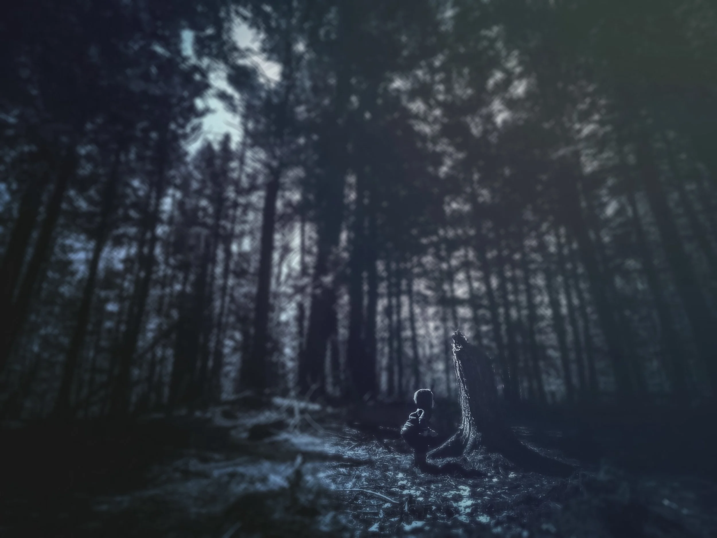
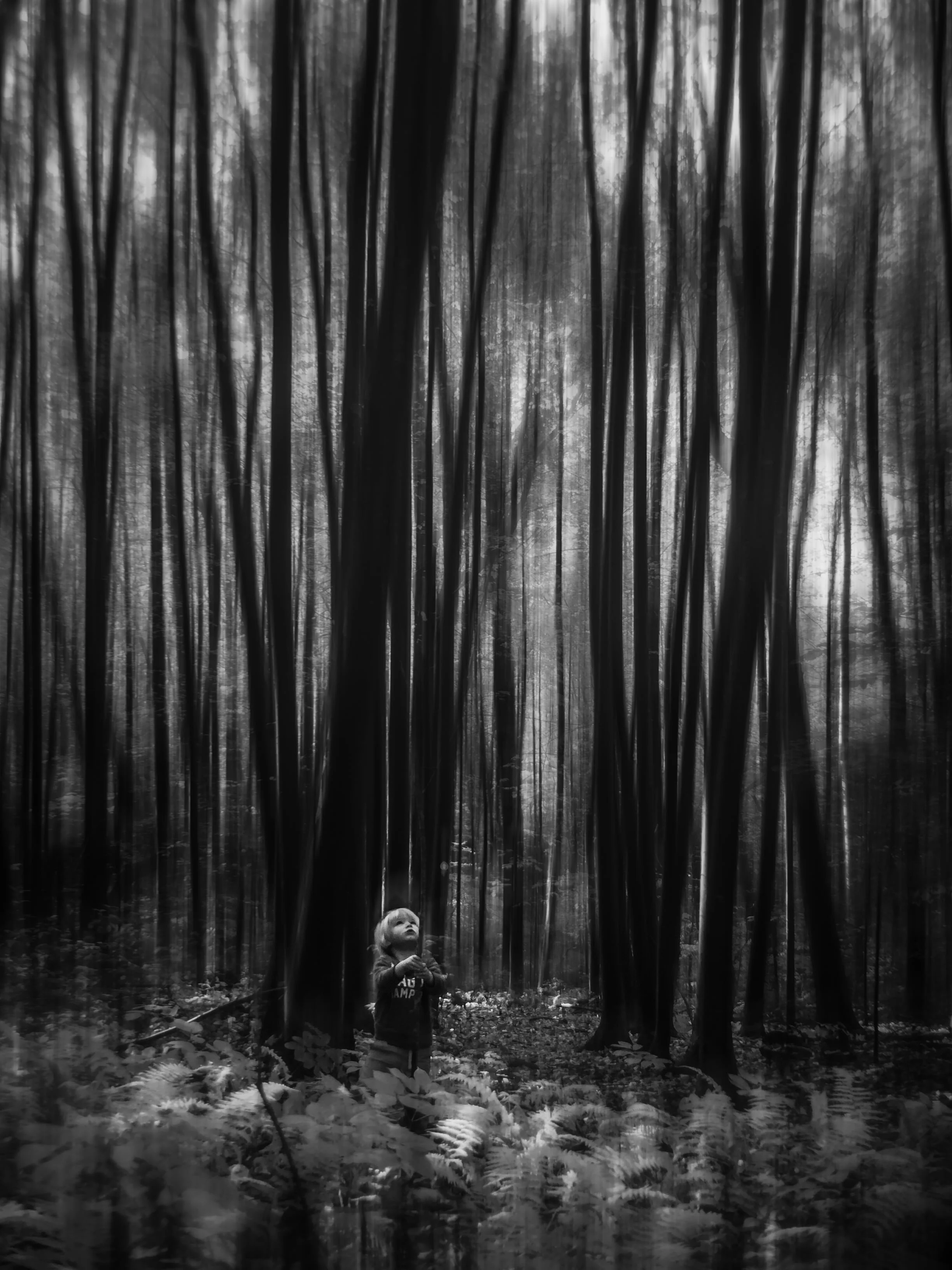
I have some straight up black and white photos that are up there on my list, but this one is among my favorite Mextures edits. It could really be the standalone shot for the “tiny adventurer” series because it just captures the heart and soul of it … a little guy just being … just getting after it. The shadow and size in this one kinda nail it for me. The idea of youth and a world that is so big you are just entertained by every little thing. And it has that tension I was talking about … an almost mysterious storybook aesthetic. I feel like the woods are entertained by him … protecting him even from the bull sh*t he will inevitably face as he grows up. Perhaps the forest is throwing a bit of light on him and maybe that giant tree tossed that stick he is picking up. Or maybe he is this little proton and the one lighting up a dark place. Anyway … the textures and perspective are there and I embraced a more distressed painterly look than I am usually comfortable with.
WHO ARE THE PEOPLE THAT HAVE MOST INSPIRED YOUR WORK?
I feel like my greater point-of-view are inspired by a handful of poets I really like (Blake, Yeats, Eliot and Wallace Stevens). That said, let’s talk about Instagram people who are inspiring to me and whom your audience should check out if they haven’t already.
In no particular order:
@picturedpoetess - Imagine if Andrew Wyeth and John James Audubon time traveled AND made a baby together. Their offspring inherits both their talents, but is raised by horses in Canada … and only takes photos from the deck of a speeding train. She’s hauntingly good and her images move.
@_galathea_ - Pretty sure she has super-natural powers and can control natural light with her eyeballs. I don’t mess with her. She only tells you part of the story.
@zeyneperkohen - Negative space minimalist master … see’s in shapes (not color) … one of the few people whose work I see and say to myself—"f*ck that’s a cool idea”.
@fridakitten - She makes the color brown look pretty. Enough said. I steal her killer formulas, but always lend her alternative nonsense captions for her shots. I’m fairly certain she is a florist in a community exclusively populated by butterflies. Or a photographer that primarily serves butterfly florists.
@dan.jones84 - Ok. Now imagine Audubon says “f*ck all this drawing and painting”, ditches Wyeth and starts shooting photography through a microscope. Dan’s a macro master but not boring scientific macro…he has good composition. He’s probably underwater in Borneo right now so he doesn’t give a sh*t.
Take a look at more of Geo’s work here!
