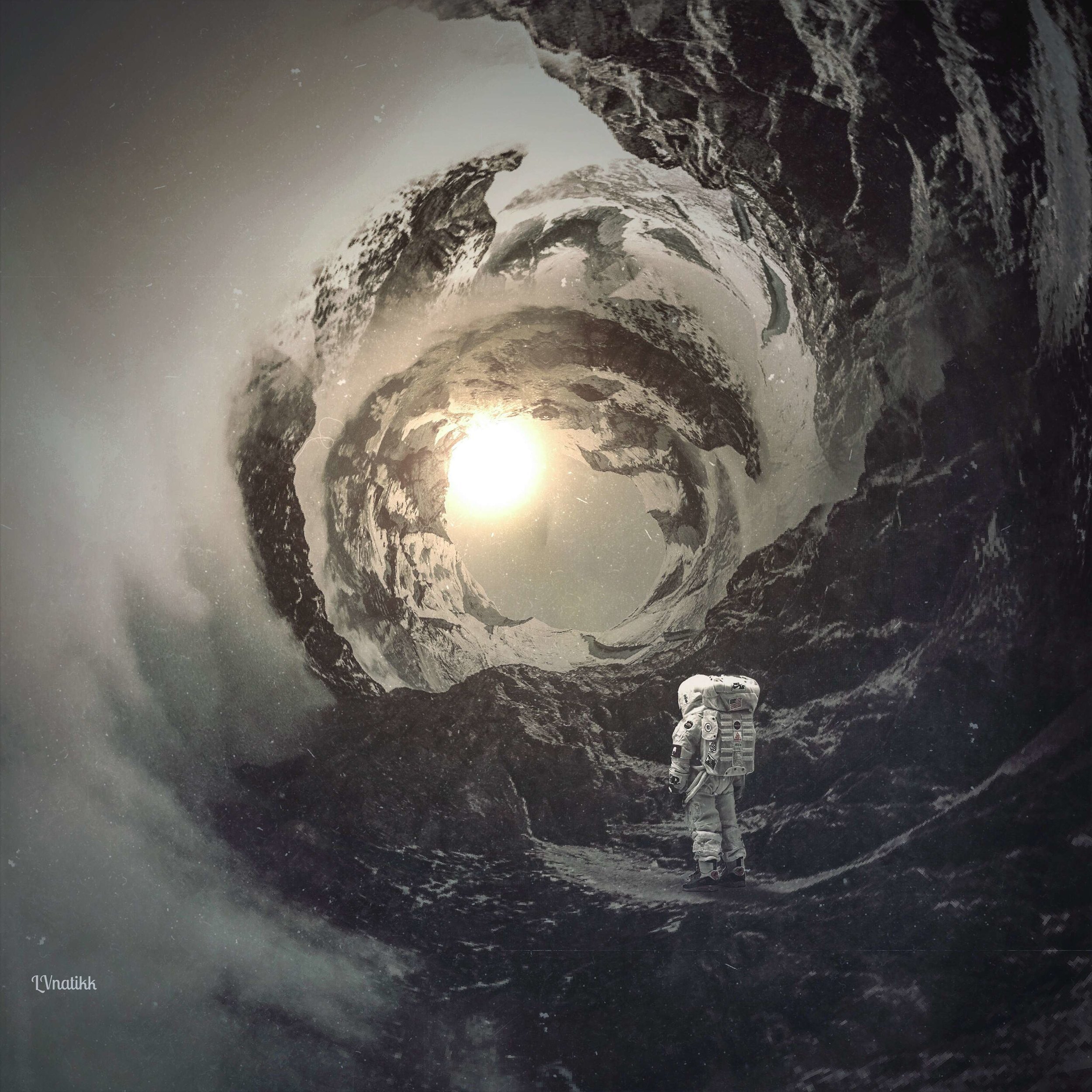
HIGHLIGHT: LILY BANSE
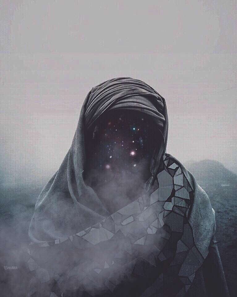
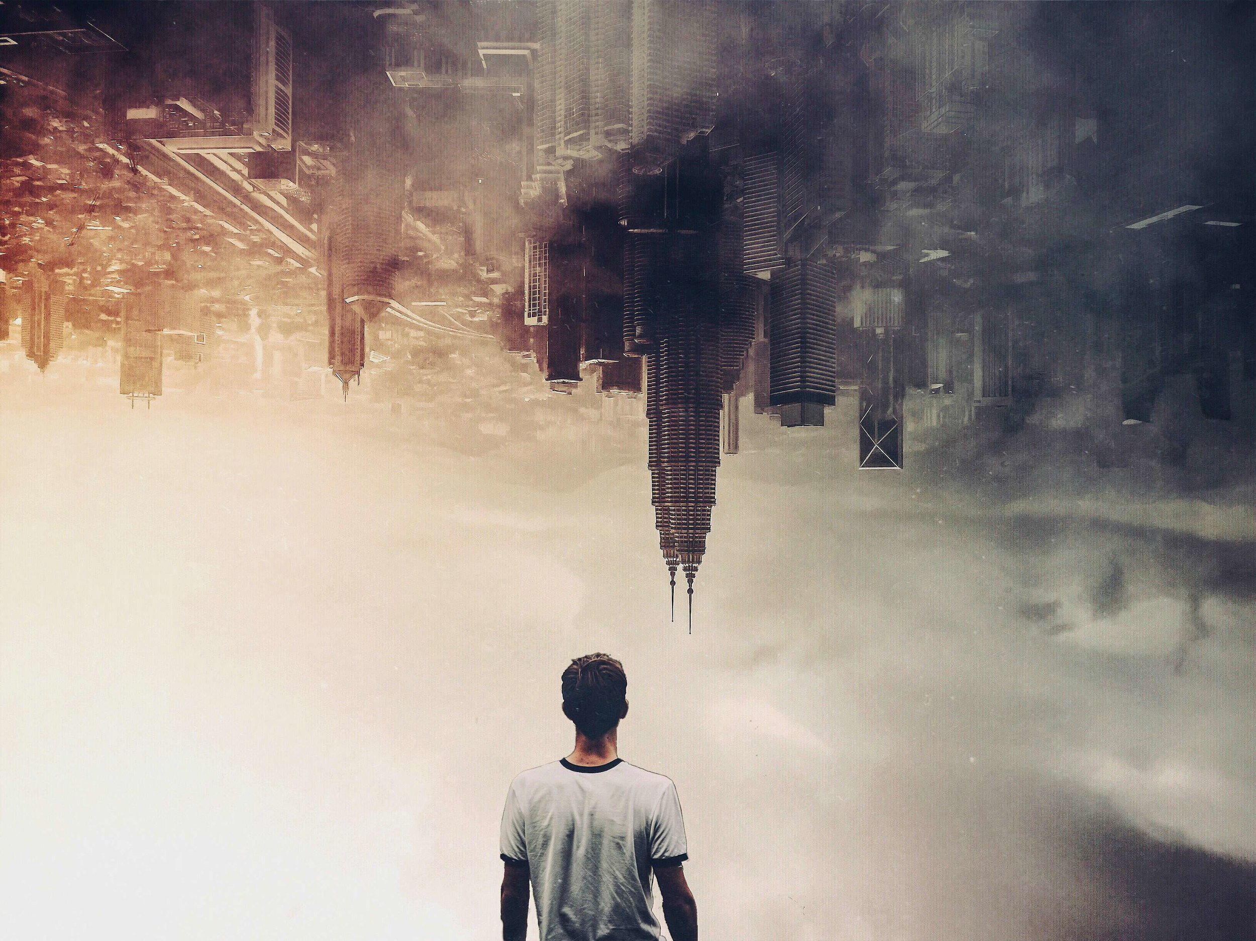
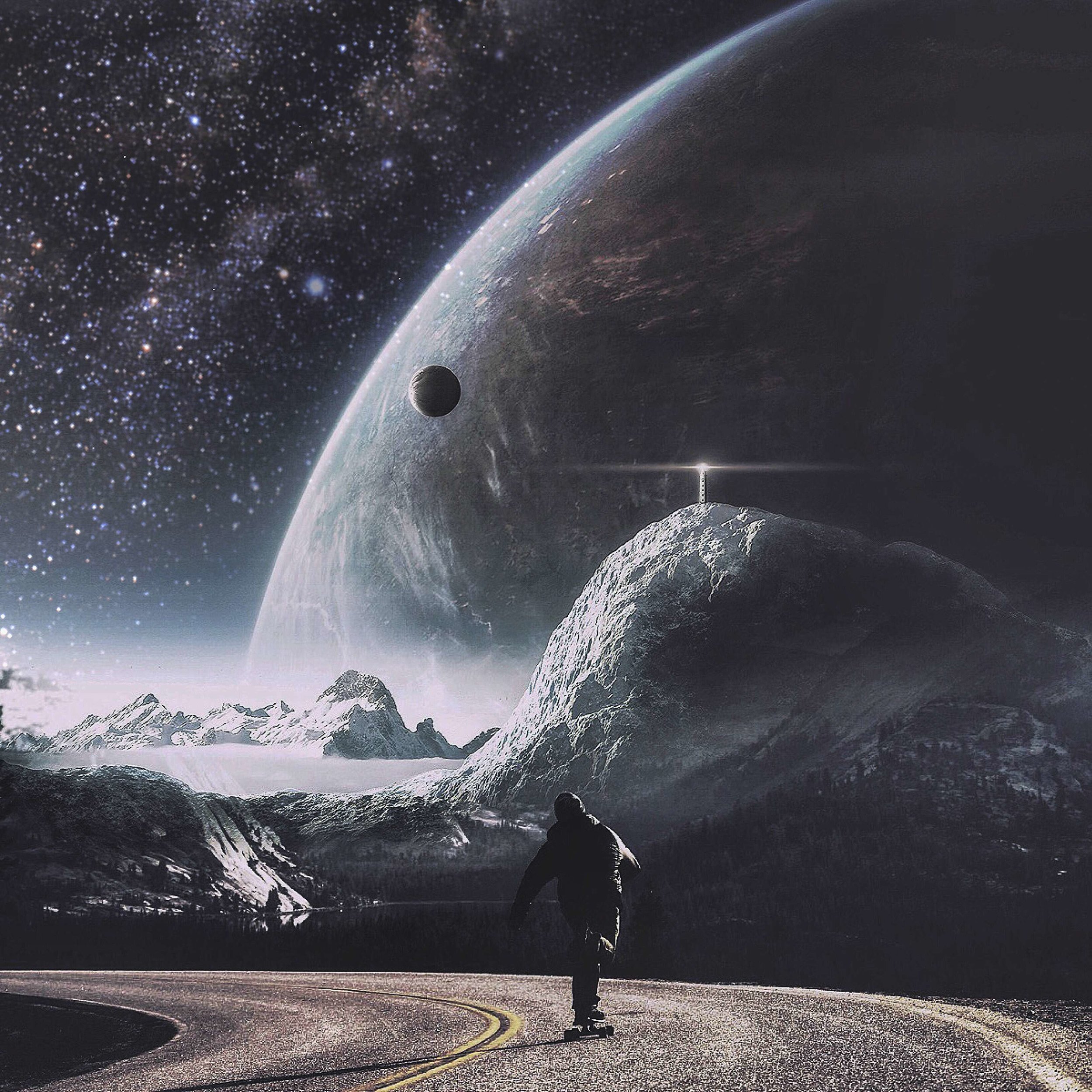
With creativity seeping from every cell, Lily (@lvnatikk) has constructed a wonderland of awe-inspiring images. Diversity of subject, focus, shape, color and light paints Lily's Instagram feed from top to bottom with some of the most beautiful and innovative work we've come across. Using a variety of apps, she achieves a distinctive and remarkable feel and look with every piece. Lily was gracious enough to chat with us and to give us a behind the scenes peek into her editing process. Keep reading to discover more!
My name is Lily and my Instagram username is @LVnatikk. I am from Singapore. I work in advertising during the week and on weekends I work in Tourism and Attractions on a small island South of Singapore called Sentosa. I am a freelance photographer as well and sometimes I have jobs for night events and restaurants.
As you may already know, I love to play with iPhone apps, but that does not mean that I am on the phone all of the time. I have a huge passion for photography as well - mostly street photography as I don't really travel much. Singapore is a small, modern city so most of my photography is usually street photography. You can check out my other Instagram account (@Seventeen10), where I usually post my photography just because I don't really want to mix my graphics and my photography.
I think that I am quite an easy going, down to earth person (I havent gotten complaints so far), and I am happily married to a gorgeous woman (@MrsLVnatikk) and have been for 3 years.
HOW DID YOU FIRST GET INTO PHOTOGRAPHY AND GRAPHIC WORK?
For my graphic work, I came across Double Exposure on Instagram. Some of the users were using their cameras for DE but there were some who did DE with iPhone apps. I did not have a camera that had a DE function so I purchased an image blending app (Superimpose) from the App Store and then I found out that I could blend a few images together.
I started off with random images that I took with my iPhone 4s, and then discovered that there were Free For All images online whereby people would submit their images for others to use. I found better looking images than the ones I had so I used them from then on.
A friend at work introduced me to Mextures where you can add all kinds of filters and tones and was more diverse than the apps I was using at that time (VSCO, Snapseed, Picsart). Filter apps like these are a good "finishing off" point for the images I blended together since the stock photos had different tones of color. The end result of using filter apps is much more satisfying than the photos straight out of editing, in my opinion.
It takes a lot of patience and practice for graphics I think. I started out with a couple of hours for just one image and now it could take me around 10 minutes. But it also depends, it could take days for one image to complete, as sometimes I would feel that that particular image had something missing. I would get back to it when I had an ideal finished edit.
For photography, I was really inspired by some big names on Instagram like @13thWitness and Lane Dorsey and how they managed to capture the right light at the right time. I think light is everything in photography, whether it be night or day. I also believe that perfect lighting does not really last long and it's difficult to capture a perfect moment in that perfect lighting, which these guys really have an eye for.
I don't own a DSLR at the moment but I borrow one sometimes from good friends who trust me with their equipment. I plan to purchase one in future but I think I need to brush up on my photography first. Like they say, practice makes perfect.
WHAT IS IT ABOUT DESIGN THAT HAS REALLY CAPTURED AND KEPT YOUR INTEREST?
I love how one can manipulate reality in so many ways using apps. The fact that you can do it all on your phone is amazing. It's everywhere and anywhere - limitless. It keeps the imagination going where ever you are no matter who you are and I think that imagination has no boundaries.
I like the fact that we all inspire each other as well. The diversity is simply amazing.
WHAT INSPIRES YOU TO CREATE MORE THAN ANYTHING ELSE?
My mood usually gets me editing and good photos definitely help. I also watch a lot of movies. I love movies with good soundtracks. But yeah, usually it's the mood, whether good or bad.
WHAT DOES YOUR EDITING PROCESS GENERALLY LOOK LIKE?
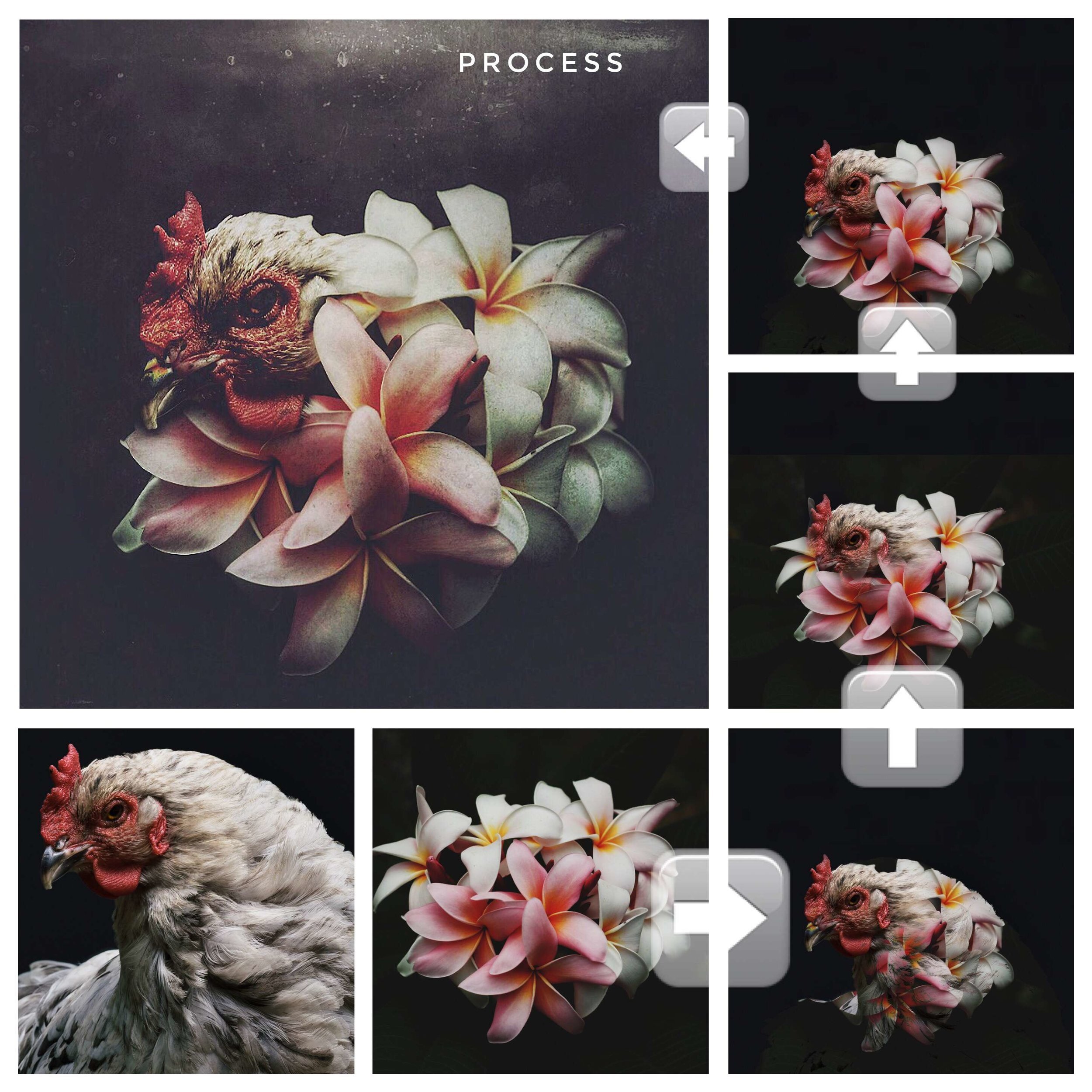
Here's an edit that I created recently. I've pasted the end result and process images and I've saved the formula as well (FNUEFRM).
This was done using only Mextures and Superimpose App on my iPhone 6. The images were from Unsplash, where I usually get stock images from. It's a really good site and it’s all free.
I don't profit financially from these works so my conscience is clear when I use these stock images. Usually, when I post them on Instagram, I mention where I get the images from.
HOW SPECIFICALLY DO YOU TEND TO USE MEXTURES IN THAT PROCESS?
Well, for the image above, my first step was to add a film preset, which in this case was UV. I also added Tesla because I needed the image to be slightly "crisp" and not too simple, just to add a little Emulsion at the top. I used Vignette as well because I didn't want the image to be too dark around the edges.
I would say my favorite blend modes are Overlay and Screen. I use the others but it really depends on the image. For overlays, I would have to say Seafoam, Frozen, Winter Skies, Indigo, Dusted, Frosted, Navy and Vignette are my favorites.
For the film presets my definite favorites are the “F” series: Fade, Astia, and Provia. They're the best in my opinion.
If it matters, I listen to music when I edit. That is definitely something that I can't go without. I was listening to Tchaikovsky, performed by Evgeny Kissin while working on this edit.
WHAT IS IT ABOUT MEXTURES THAT YOU FEEL MAY SET IT APART FROM OTHER APPS?
I love how mextures allows you to save formulas. I dont think there are that many apps (that I know of) that have that special touch. In fact, I've picked a few of my favorite formulas that I've created to share here:
Nepal - XNSIAGD - This one makes an image seem colder and more mysterious - almost Winter-like. I use it mostly as a base for my edits and then I adjust the settings accordingly.
Banse - SGDEHEB - The effect that this formula gives to an image is mostly Vignette. I think it fits nicely for images that have something central to focus on. It's got bokeh and has a warm but mysterious feeling to it.
No Means No - ENQTRLH - I am quite proud of this formula. I mostly use it for macro images, like insects or flowers, where they have prominent colors. It makes the color really pop out. I tried to keep it to a minimum though.
Sleepyhollow - KCYLFVK - This one is for minimal edits as I feel it just adds some rough texture and grain. I feel it's perfect for outer space images.
WHAT HAS BEEN YOUR FAVORITE PIECE TO CREATE SO FAR?
Here’s one that I've done recently. Although I don't really have a favorite, I guess I like this one because it's imaginative and simple.
I took the whale and diver image from Unsplash. The moon was from an editing app called "Alienskyapp". You can get all kinds of stars and planets from there.
WHO ARE THE PEOPLE THAT HAVE MOST INSPIRED YOU?
They are mostly people on instagram.
I've come across people like Ben (@figment_HF), Jamie (@Prahaboy) and Josh (@Casualtyofcool). They have awesome posts and I get inspired mostly by them.
Apps wise, when I was starting off, I sieved through comments of other users and their hashtags to see what apps they were using. I then learned to use them by myself, mainly because I don't really like to bother people with questions.
The formula section in Mextures has really helped as well because that’s how I learned how to play around with them.
You can view much more of Lily’s gorgeous work here!
