JORDAN SALMON INTERVIEW
Graphic design is easily one of the more visually stimulating genres of art in which we find Mextures utilized during the creative process. And Jordan Salmon (@jordandesignsthings) is easily one of the more visually stimulating graphic designers that we’re aware of. We have found his work to be complex, emotive, and altogether beautiful. Having observed and enjoyed his creations for some time, it only made sense that we chat with him to learn more. Read along!
Well, for starters my name is Jordan Salmon (spelled just like the fish) and I am a 25 year old graphic artist based out of Ontario, Canada. I am a huge lover of art and an avid book reader. I love reading anything from high fantasy to any literature that can shake up my faith and really get me thinking. Not growing up in a religious family at all, I stumbled upon my faith on my own and I think it helps me put my mind at ease when I am creating. Aside from art, I spend my time hanging out with my Rottweiler, Jango, and my awesome girlfriend who gives me so much support in what I do for a living. I'm also a huge nerd and I love building PC's and gaming.
How did you first get into design?
When I was 12 years old my stepmom put her second copy of Photoshop on my computer. I was pretty overwhelmed with the software but she showed me how layers worked and as soon as I was able to wrap my mind around that I just went from there - completely self taught. In my teens I got sick of relying on flakey graphic designers for band artwork so I started getting more in to that. Once I felt like I was at least decent at what I did I started offering my services to other bands. It pretty much spread through word of mouth after that and now I work full time in the music industry making stuff for bands.
What is it that keeps you interested and passionate about creating and designing?
I think my faith plays a strong part in it. I really feel like creating things that move people is something I am called to do, if that makes any sense. I really don't do it for money, and if you were to tell me that as of tomorrow I wouldn't be making any more money in creating/designing, it wouldn't stop me in the slightest.
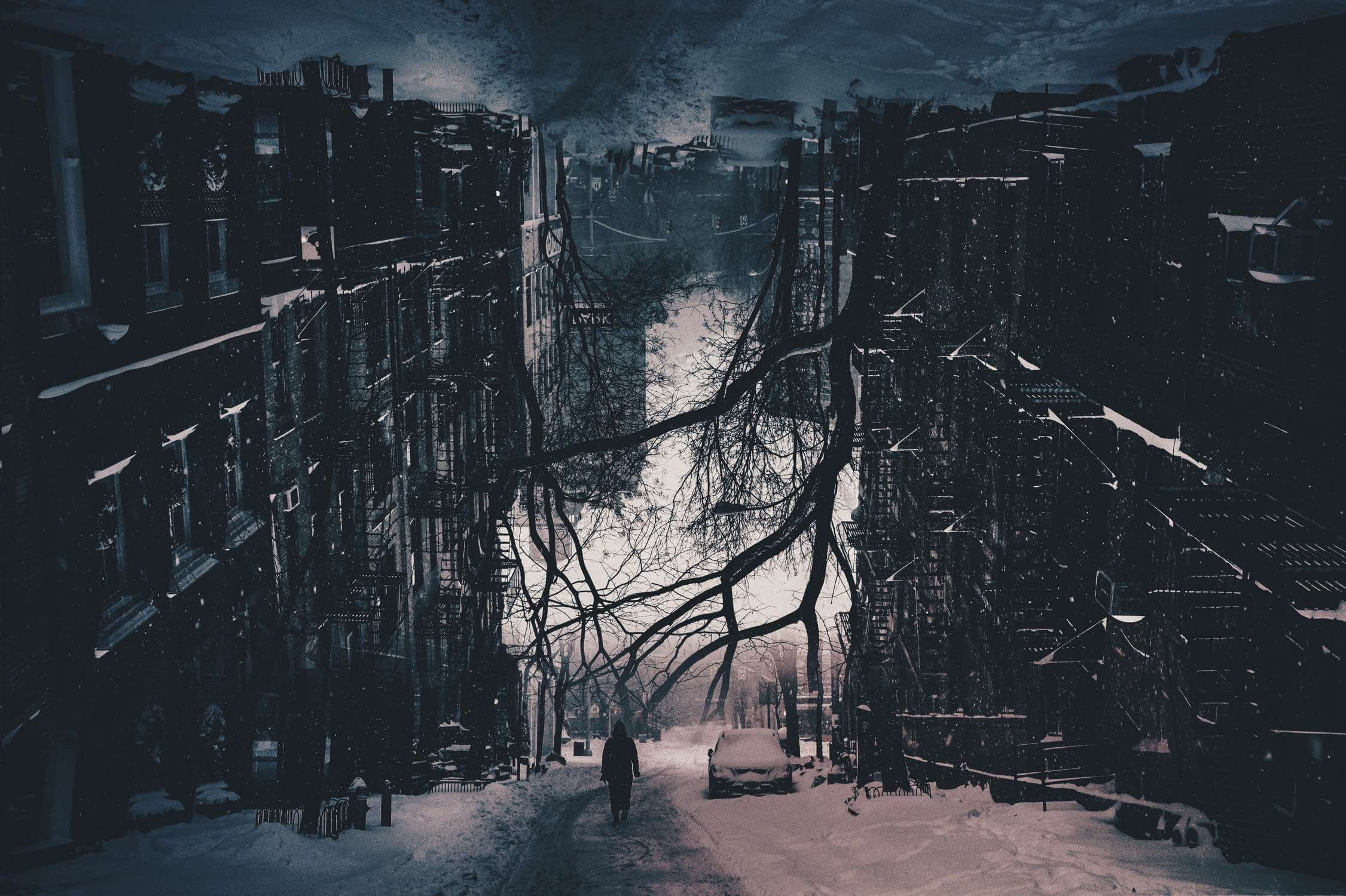
I think for me it also helps express what is going on in my head. I am not good at putting things into words but I am good at putting chaos into pictures. That's probably why most of my work is a little darker or ominous. I have an anxiety disorder and creating helps me keep my mind on track. Rather than bottling things up, I put them right out there for the world to see.
How has social media played a role in your work?
Social media has been critical for my work. Because I do most of my work in the music industry almost all of my clients find me through my daily Facebook/Instagram design posts that I put up. It's also great having some sort of following that looks forward to seeing new things that you post because it kind of keeps you motivated to keep posting work daily. Sometimes I have weeks of creative block but other than that I try to post every day.
I think a big thing to note with social media though is that it's really easy to fall into this hole where you figure out what people 'like' or what is going to get the most comments/shares/whatever, and then you start creating for other people and not yourself. For about 6 months I fell into that hole and though my social media blew up I felt like my quality of work was much lower and didn't have much emotion or message, because I was creating things that I knew people would like and not creating because I wanted to express myself or my thoughts or feelings.
What have you found to be your biggest challenge in developing your trade?
I'm very hard on myself. There have been a few times where I have stopped sharing my work on social media because I felt like it wasn't good enough. Or I will see work from other people and think to myself how much better it is than what I do. In a way it is good because it makes me work hard, but feeling like I don't deserve the attention or the ability to do this as a job has definitely been a big struggle for me. You guys have shared a few of my pieces and I always remember thinking there was way better stuff that could be shared to your followers. I remain grateful every time though.
What is it that you want to communicate with your work?
I think what I want to communicate most with my work is to not take everything for face value. A lot of things I make can be taken in so many different ways depending on your perspective. I want people to look at the world the same way they look at my art: thinking critically and reading between the lines and not taking it at face value. A big issue in the world right now is that people see or hear one thing - whether it's in the media or wherever else - and they form such a broad opinion before really thinking critically about something or looking at the other person's point of view. I think a lot of the problems we face could be solved simply by looking at things in other perspectives, placing yourself in someone else's and trying to understand why they think or feel how they do.
What does your editing process generally look like?
Usually, I have a rough idea of what I want to do and then I go image searching. Unsplash/Pixabay for my daily work and Adobe Stock for my commissioned work. After I put together a few drafts I decide which I like the most, usually with some input from my girlfriend. Then I do the final touches which usually end in Mextures in some way. The best thing about mextures is being able to export in high resolution, so even though I do all my work on PC, I can do lots of cool final touches with Mextures at the end. I have a huge library of custom presets that I've made that just bring a whole new dimension to my work. A lot of my edits start with things I am reading as well. I love to read and sometimes sentences will stand out to me and I'll have to put my book down to make something of it.
How specifically do you use Mextures in that process?
One of my main uses for Mextures is all of the various gradients that are available. Radiance, Landscape Enhance, and Atmospheric contain gradients that I use in almost all of my work. When combining a few of them with various blend modes, you can get some really cool results. If I ever feel like the design calls for texturing I will always turn to Mextures for that as well.
Do you feel like Mextures offers anything unique to your editing process?
The sharing aspect of Mextures is really awesome. There are so many little tricks you can do so it's great to share the formulas for others to see/use. I love figuring out cool ways to get some weird results with different blend modes for various gradients, and then sharing the presets with others. Art is all about sharing your knowledge because that's how we keep it moving forward, and Mextures really embraces that mindset. A lot of other editing apps don't like to export in full resolution either, and Mextures can work with uncropped full resolution photos.
Can you share some formulas?
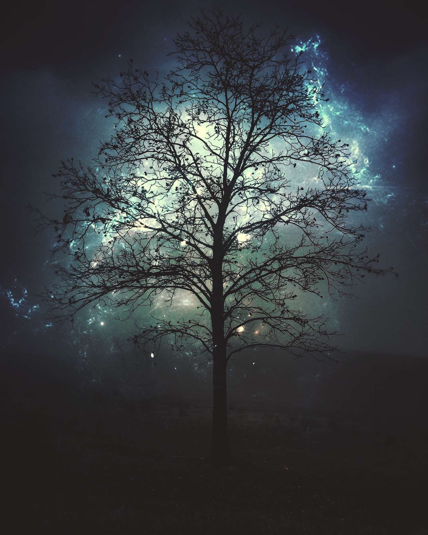
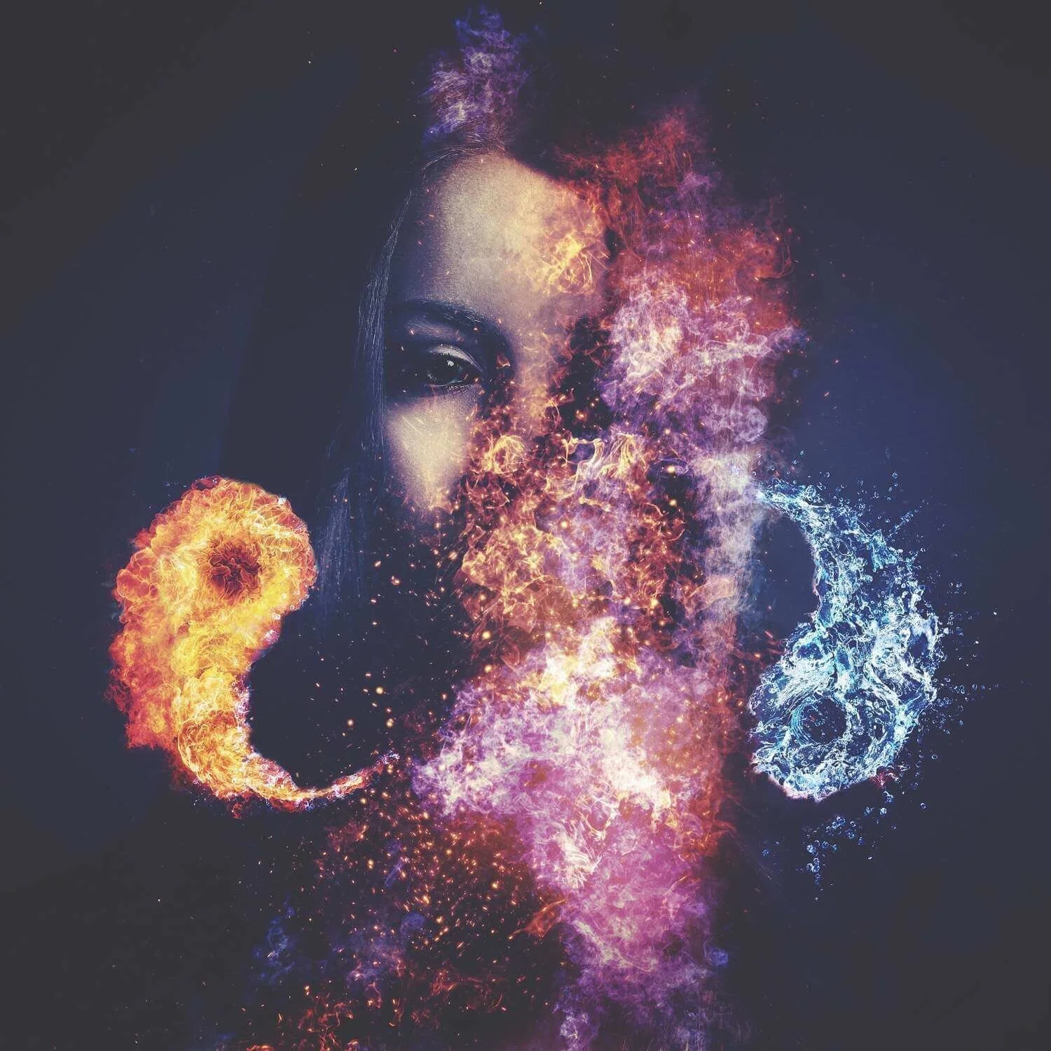
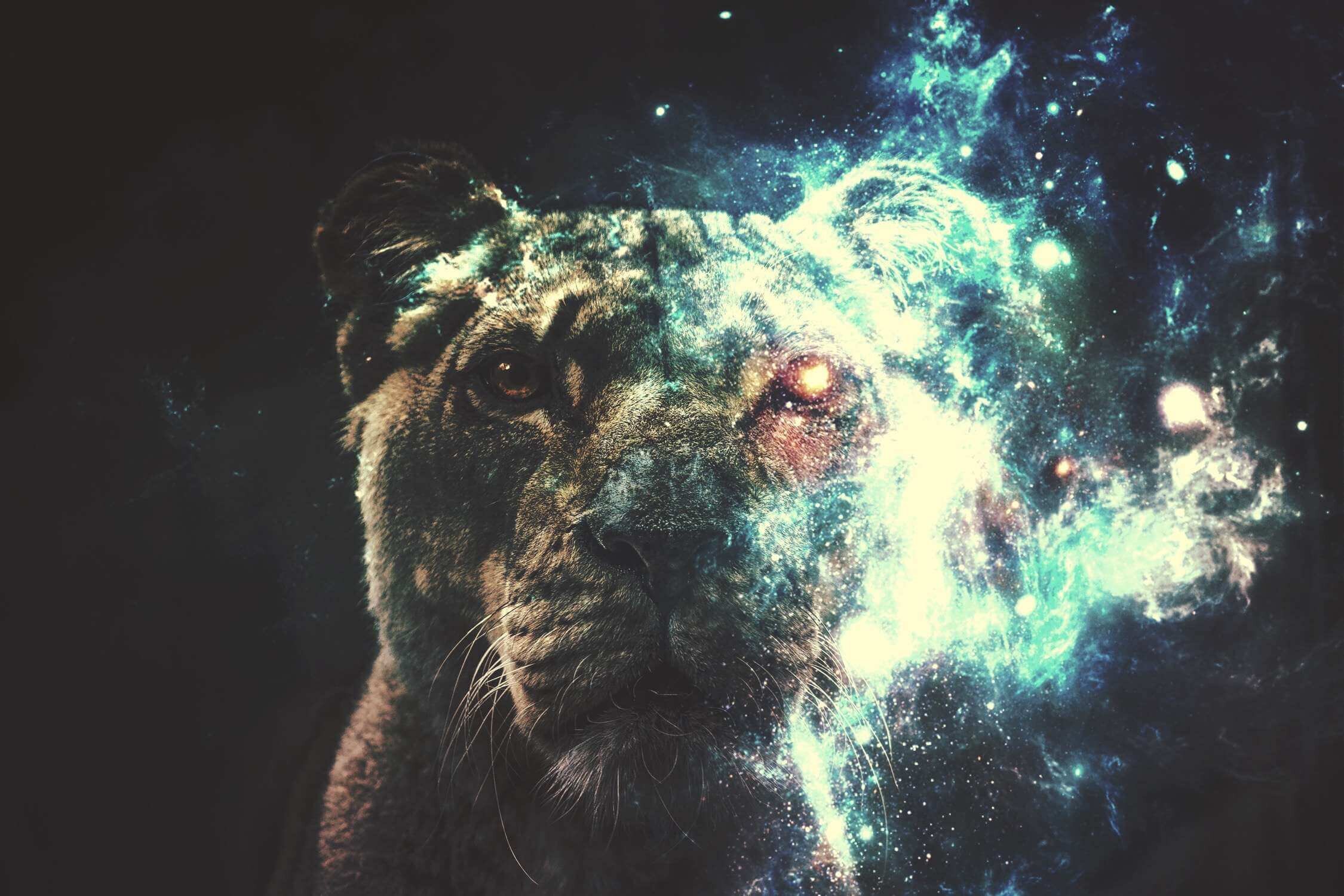
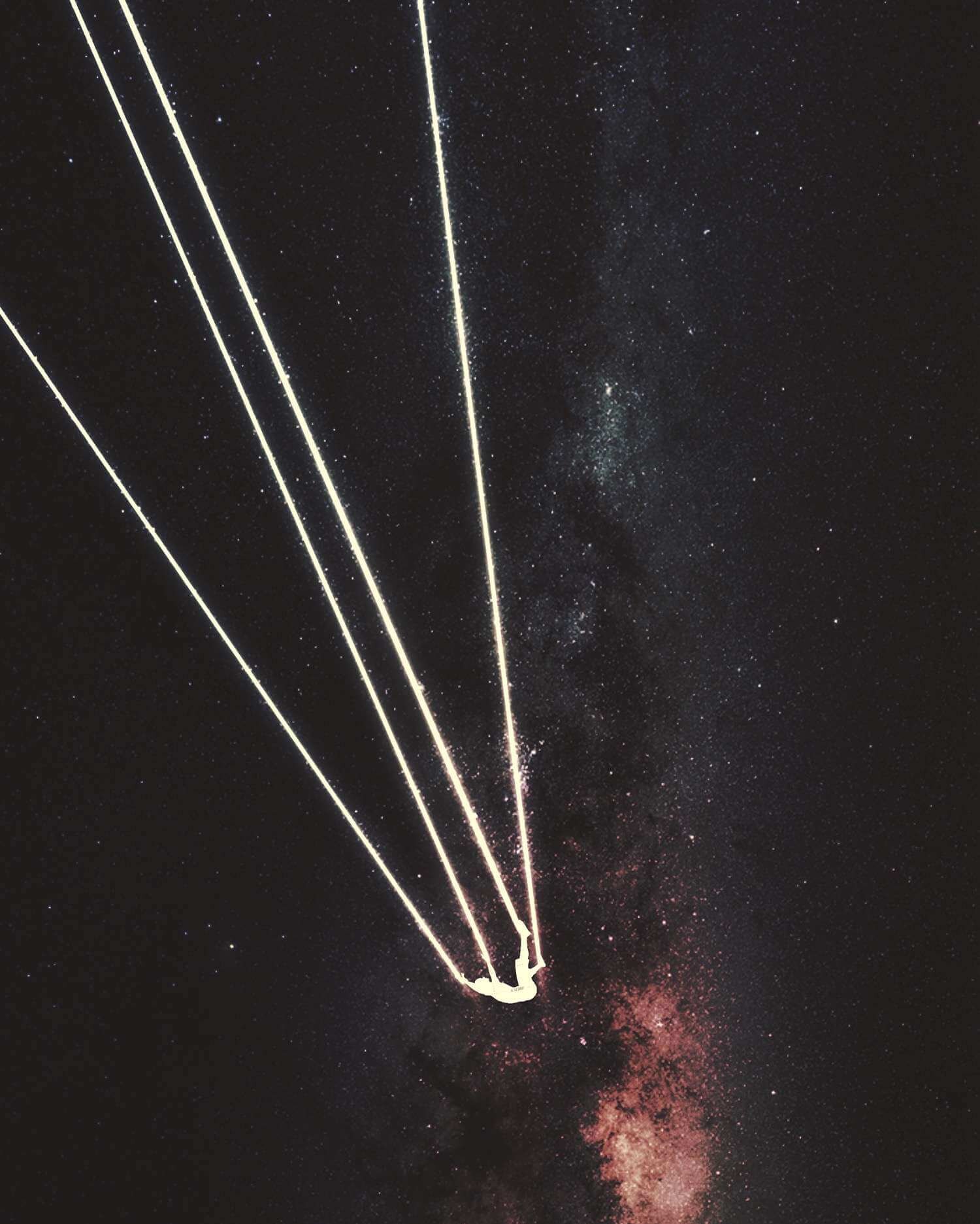
Glowstick - WRQNWEI Astronaut - SEZVIBD Parachute - YRITYAG Digital - ALYNWQF
All four of these formulas go along with the techniques I use to create darker, more ominous looking photos. I have layers in each formula set to 0% opacity as I like having the freedom to quickly pick one of my presets, and then adjust the visibility of certain layers to change the formula to fit the needs of the image. Glowstick and Astronaut are great to use on brighter photos to desaturate and create a darker atmosphere on a photo where it generally wouldn't apply. Parachute is very similar. However, I like to use it on photos that have a lot of reds and oranges. The Phosphorous overlay works great to bring out the warmer colours, and I have a Vignette layer that you can boost the opacity on if you want to darken the edges a little bit. Digital is based on an album cover I created for a client called "Digital Citizen." It's based on one of the presets in the Dust and Dirt formula pack with a few tweaks from my end. It's great for a grungy effect on darker photos but I would recommend reducing the visibility of a few of the layers if you're editing a lighter image as the dirt textures will really stand out!
What do you think makes a memorable piece?
To me a memorable piece is one that invokes emotion in some way. Sometimes the simplest piece really speaks to me so that I just have to stare. I hope I am able to do that for someone.
Who are the people that have most inspired or contributed to your work?
Salvador Dalí is probably my biggest inspiration. His surrealistic pieces have so much depth to them. It's like a new story every time you look at one. To this day I notice little nuances that I hadn't noticed before.
My good friend John Holst was a huge mentor in my transition to full time graphic design. Aside from helping me snag a ton of awesome clients for more corporate design work, he really helped me learn the ins and outs of how to professionally handle a design project. From sending proposals to timelines to storyboard and invoicing and everything else I can think of really.
See more of Jordan’s graphic art here!
