FORMULA WORKFLOWS: LEARNING FROM THE PROS
We understand that sometimes it takes more than just a formula code to discover what certain creatives use Mextures for and how they go about doing so. We spent some time with four of our favorite artists from four of our favorite photographic genres. We spoke to Mitch Mey (Mitch Meyer Photography) about his beautiful and colorful portrait work, Mike Poggioli (@mpthecomebackid) about his stellar cityscape work, Mike Parisella (@slimesunday) about his wildly cool creative visuals, and finally Tim Hayes-Foley (@tim_hf) his lovely . Each creative picked a particular piece of theirs and walked us through their editing process, allowing us all a glimpse into how they use Mextures to create certain effects on their images. They even shared their formula codes along with their behind the scenes insight. Have a look at the before/after images and read the brief walkthroughs that they provided because learning is neat!
Editing portrait work with Mitch Mey (Mitch Meyer Photography):
I didn’t want to add any more texture overlays to the image since the ice already had so much cool texture in it. Instead I wanted to enhance the texture using a Landscape Enhance overlay. I also wanted to give the existing color more vibrance. The purple sky and blue ice give the image a more surreal feel. I didn’t have to do much to enhance the image and make it that much more impactful. Sometimes less is more.
I started with the Neutral Density Overlay to darken the ice and bring out the contrast. The used the polishing tools to help pop the color and up the contrast. I added the Omnious layer to give a subtle warmth to the snow and shadows - again for a little more contrast. Finally, the Lilac overlay was to just give an overall cooler tone to the image.
You can see more of my stuff on my photography website.
Formula Code - AJJPDRI
Editing cityscape work with Mike Poggioli (@mpthecomebackid):
I am a huge fan of radiant color. I used to put as much color in my photos during editing as possible, but over time I've been more strategic about which colors I add, combine, and how much saturation I leave. Mextures is like a playground for me to always be adjusting and experimenting with the perfect balance of color. This shot was taken in mid-morning, when the sun still had that warm morning glow to it, so I added a hint of Citrus for emphasis. I really enjoy the presets found in the polishing section. Here I used a lower level "F-160." Simple adjustments like boosting temperature, contrast, and saturation also helped. I also love the light leaks in Mextures, especially the Seattle one, which I added and rotated to imitate the direction the sun was coming from. Finally, the Vignette layer in the Landscape Enhance pack is always a go-to to "close" the frame. Hope you enjoy the formula!
Formula Code - SHWHQSM
Editing creative visuals with Mike Parisella (@slimesunday):
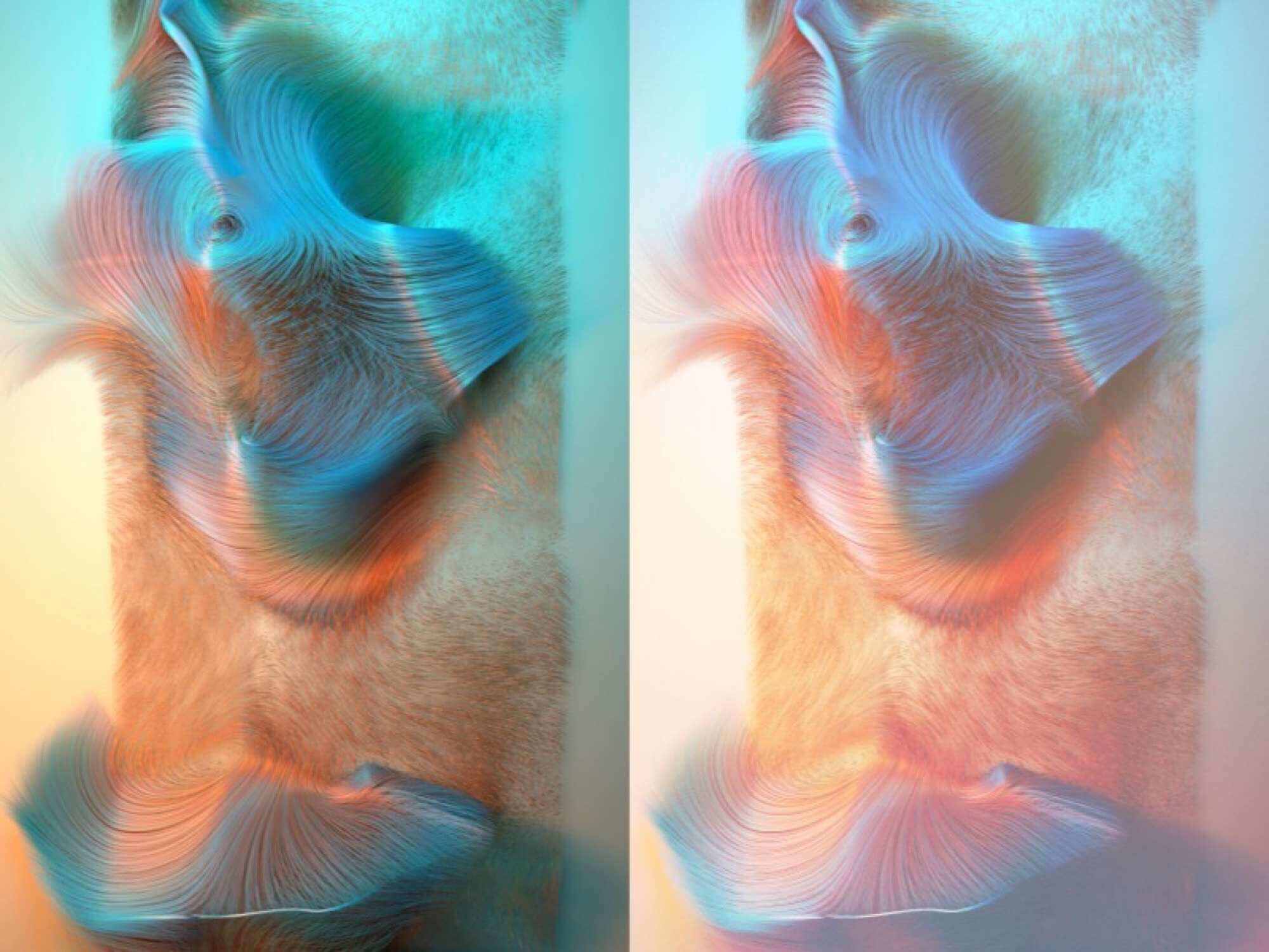
If you’ve used Mextures, you probably know that anything you put into the app will come out great. Like I said, take a picture of a fire hydrant, throw it into the app, and boom, it looks dope. Lately, I’ve been using Mextures to really get some nice atmosphere on top of my images, almost as if there is a layer of fog or something. I don’t like to go crazy with my formulas. I keep them simple and clean.
For this example, I built the image in Cinema 4d using x-particles and the hair render. I didn’t focus too much on lighting because I knew I could take care of all that stuff using Mextures. With this particular piece I edited the image in Photoshop using the Mextures Premium overlays!
The first thing I did was take the Citrus overlay from the Landscape Enhance pack and threw it on the Lighten blend mode. I rotated the overlay so that it was on the bottom of my image and put the opacity at 20%. The purpose of this was to reduce the intense shadowing that was going on at the bottom of the image. It also allowed me to boost my oranges a little.
Next, I used the Somber overlay in the Atmospheric pack. Here I was just trying to snag some colors that were close to what I had going on in my image. I set Somber to the Lighten blend mode as well and boosted the opacity to around 90%.
At this point I needed to find a way to brighten my image a little, so I went back into the Atmospheric pack and grabbed the Passive overlay. I set the blend mode to Color Dodge and boosted it to around 60%. This really brightened my image and got it to just about where I wanted it. You don’t usually want to set Color Dodge as hight as 60%, but for some odd reason it worked perfectly here. Usually 10-15 percent opacity is enough to brighten the scene.
Next, I wanted to use the Anomaly pack on Lighten blend mode to get that nice transparent fog-type layer on top. So I set Effigy to 86% and Microfiche to 10%
The final step for me was to grab something out of X-Film. I used Coral to help boost the orange and pink tones. I set that to the Overlay blend mode and boosted the opacity to 20%.
If you are just starting out I recommend trying every texture with every different effect under blending mode. If you do this, you will begin to see what blending modes work for each texture. You will also begin to see which textures are your favorites. Also, dont go too crazy with the textures or you will begin to take away from your image. You can use as many as you want but try to overlay them cleanly. Good luck and make some dope stuff!
You can also check out more of my stuff via my Society6 site.
Formula Code - IXLFSDH
Editing landscape work with Tim Hayes-Foley (@tim_hf):
So my editing style is more towards the moody style of things. I'll walk you through as to how I create these types of atmospheres.
The first thing I like to do once I've imported my shot into Mextures is to choose the film preset. You can find this in the adjustments section of the app. The film preset M'm going to choose here is PX-70. I've personally found this to be one of the best presets to use for a moody atmosphere. Once you've selected the PX-70 preset, you'll notice it gives a very yellow tinge to your shot which you don't necessarily want, so to correct this we need to stay in the adjustments section of the app and select the TINT option. Here we are going to slide it all the way to the top but it might still not look quite right. So we now select the TEMPERATURE option and slide that almost all the way down. You're going to be left with a very blue film across your image which I wanted to correct. The way we do this is by selecting the SATURATION option and once again sliding it to the left to almost nothing. Go to the FADE option and slide this up to about 25%. This step just adds to a more moody feel. Now select the CONTRAST option and slide that up from the middle about another 25% and do the same with the EXPOSURE option. These last two steps will vary depending on the shot you're editing and your own personal style.
So these are the steps I used to create the "base" for my edit, now we're going to take a look at all of the great textures and layers that Mextures comes packed with!
The first two layers I'm going to use are from the Landscape Enhance pack. First up, the VIGNETTE layer. This darkens the edges around your shot. In this case it's enhancing the general “mood" a little.
The second is the NEUTRAL DENSITY layer which has a fade from black at the top to light gray at the bottom. I used this to darken the upper half of my shot over the trees.
Next I used the INSIDIOUS overlay (blended in Hard Light) from the Atmospheric pack. I used this to "direct" the way the light came through my shot.
The last Layer I used is WINTER SKIES, again from the Landscape Enhance pack. This was used to bring out the foreground in my image. This is a great layer to use if you want to expose a certain section of your shot as it has a reasonably dark to very light gradient!
Finally I bumped up the SHARPEN in the adjustments section. This step also will depend on your shot and personal style.
If you import my formula you can see what percentages I've set the opacity on for each layer as well as the position of it. I hope this has helped. Please don't hesitate to drop me a DM (@tim_hf) if you have any questions!
Also, I have 12 pictures being featured over at the Mextures Collective if you want to get in on that!
Formula Code - CSTLTNRDig in to all of the work from these gents. You won’t be disappointed by Mitch Meyer,@mpthecomebackid, @slimesunday and @tim_hf!


