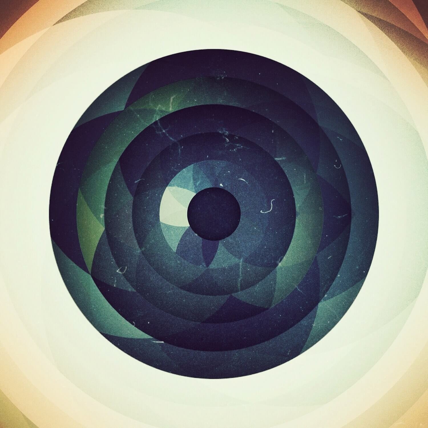
AARON CAHILL FEATURE
Aaron Cahill (@nghbrs) is well known by us and thousands of others for his uniqueness, his inventiveness and his wildly cool creations. His design work is perfectly colored and perfectly toned and encompasses a massive range of shapes, textures and blends. Recently, Aaron found some time to chat with us about his journey into the world of iPhone design and Mextures in the freshest addition to our featured artists series. Read on! My name is Aaron Cahill. I'm an Associate Creative Director for VI Marketing and Branding in Oklahoma City, OK. Although I was born and raised in San Antonio, TX, I consider myself an Oklahoman. I’m an avid record collector. Everything from 90’s hip hop to James Brown 45’s to Dilla breaks. Lately I’ve been digging for more downtempo electronic and slow disco. Stuff like Saine, YSE Saint Laur’ant and Suzanne Kraft. And, of course, I’m very passionate about graphic design.
What attracted you to graphic design?
You know, I’ve never really thought about it. How sad is that?! I’ve always just kind of enjoyed it. I was always drawn to album artwork. Even before I understood what graphic design was. I had no idea about logo design or branding.
In high school I would do graffiti and redraw the logo of the Wu Tang Clan. Whatever hip hop I was into at the time. I think I still have a few cassettes lying around. Graffiti was my first real introduction to lettering.
I thought I wanted to be an illustrator. But the more I studied good design work the more I wanted to do that. I admired David Carson and Raygun magazine. I was really big into type foundries like Emigre. I love that it combined all of these different elements. Illustration. Type. Photography. I believe having a background in illustration helped me to be a stronger designer. Observing the small details that make up the bigger picture. It allows me approach design from an artistic perspective.
I don’t consider most of the things I share on Instagram graphic design though. There’s a fine line between art and design. I think it comes down to intent. I’m not selling anything. Sometimes there’s a concept. But I leave the interpretation up to the viewer. My Instagram work contains a lot of the visual language that makes up graphic design but most of the time it’s just experimentation. It’s probably closer to a sketchbook.
So you use Instagram as a sketchbook of sorts?
Maybe in the same sense that someone who captures their daily life would think of it as a journal. I feel that the things I post are closer to sketches. They usually come from experimentation. Trying out new apps. Seeing how I can twist and manipulate images to incorporate my own style to them. I never plan out what I’m doing with an image. I kinda feel out the direction and let the idea take shape. Trial and error. Sometimes it doesn’t work out. But sometimes I might land on something that turns into a print that I would sell. Or I might work that idea into something I’m doing for a client. It gives me a chance to go down an avenue that I wouldn’t necessarily explore in my day-to-day work. It’s all part of that process.
I wouldn’t say the type of work I was doing four years ago is drastically different, but creating artwork on an iPhone has it’s limitations. Which can be good. Those limitations helped shape the way I approach design. Instagram is a great way to share that work.
Honestly, I’m still blown away by the response I’ve received. Having the opportunity to collaborate and connect with INCREDIBLY talented artists is humbling. And that’s not what I expected from a social platform.
What first got you in to creating artwork with your iPhone?
When I first got an iPhone I messed around with Hipstamatic a bit. I didn’t care for the lack of control. Then a friend from work told me about Instagram. At first I was following people like @chrisvallejos and @colerise where I picked up tips and learned of different apps.
But I really got into it when I discovered work by @hallwood, @nadyazhry and @_lynettejackson. I had no idea that you could edit like that on a smartphone. It was a fairly new technology to me and that’s what I enjoyed about it.
Like with anything else, it took a lot practice to figure out my work flow.
What does that work flow typically look like?
My go to app is Photoforge2. I do all of my layering and masking through it. Typically I bring in geometry from other apps like Montage, Mosaic or Glitché.
Depending on the image I'm working with, I'll mask the elements, break them apart, use blending modes or even run those elements through another app to get something unexpected.
Once I have a composition in place, I start tweaking colors with Picfx, VSCO, and, of course, Mextures. Instead of relying on one setting, I build up color with small shifts in tone by turning down the opacity and layering these affects.
How do you typically involve Mextures in to your edits?
Besides using it for color, I also use Mextures for an extra layering of texture. It gives images a bit of depth. I stick mostly to Grit and Grain. Sometimes I will add it early in my editing process so that when I go to make color tweaks everything feels like it’s naturally part of the image.
I’ve also found a way to incorporate Mextures in my animations. By turning Mextures layers off and on in my animations I was able to add this nice film aesthetic.
Do you feel like Mextures offers your editing process anything particularly unique?
Mextures is great for building up tones and textures. Artistically, it can take an image in another direction. One that you maybe didn’t think to take. I love that it really allows for experimentation by adding as many layers as you want. Utilizing blending modes and being able to reorder the layers makes it different from the other apps. I think that’s what makes it unique.
Do you hope to accomplish anything in specific with your Instagram work?
Honestly, the only thing I set out to do is share my work. I didn't really think beyond that. I'm a slacker.
What has been your favorite piece to create so far?
A few of my favorites would be my first double exposure (the portrait in the intro section). For me, early on, it felt like I was able to figure out a work flow and to do something that I didn't see a whole lot of on Instagram.
The other two would be the first couple of videos I did. Again, more experimentation by combining actions from different apps.
When it comes to something like your videos, what does that creation process look like?
It's tedious and amateurish. I'm probably going about it the wrong way. Most of them are in a stop motion or an animated GIF style. Definitely choppy animation. I'll turn off a layer. Export. Turn on a layer. Export. Then piece them together with Flipagram. I've found a couple of apps that do very specific things, like Matter - which is really cool - and GameUrVideo. I also use apps like Cinematic and Cute CUT to piece scenes together. They’re not the most robust apps but they seem to get the job done.
Who has inspired you the most in your Instagram work?
Anyone I've collaborated with. It gave me a chance to see how other artists work. I've been able bounce ideas off of them and had the freedom to try something new.
Some of my favorites to work with have been @nadyahzry, @tjoeshifu, @_lynettejackson, @sarahfuchsia, @1_of_8, @maysgrafx, @chuck. There's so many more!
I also really dig @douglashale, @shane_small, @hallwood, @_al.ec, and @taylor. Just because they do bad ass work.
See more of Aaron’s work here!


